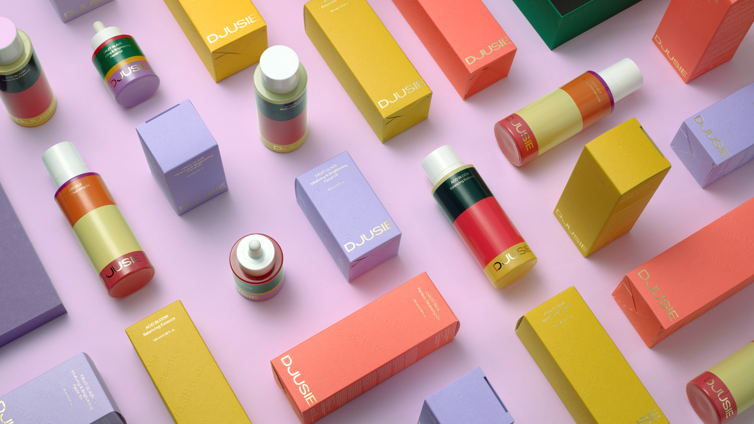
Natural cosmetics packaging often takes a dull, minimal route. Yet, Finish beauty brand Djusie is changing the narrative. Designed by Kobra, the brand’s packaging is bright and colorful, implementing clever color blocking and thoughtful embossing and gold foiling. While the color is delightful, the brand still comes across in a premium manner, proving the power of simple design coupled with vivid color and thoughtful type placement.

Djusie is a pioneer of F-Beauty (Finnish Beauty), whose high-quality Ecocert skin care products aim to redefine the natural cosmetics industry. They needed a brand strategy and a distinct visual identity to help them differentiate from the vast ocean of oh-so-clichéd natural cosmetics and allow Djusie to expand into other product groups and retail products. Regarding marketing and earned media, the packaging had to stand out in social media. The result is a celebration of the brand ethos: Everything in nature has a special purpose. There’s a reason why no one else looks like you. Everyone is beautiful and equally valuable. Everyone makes a difference in the world in their way. Everyone deserves to be seen and heard as they are and be safe from bullying. We want you to enjoy balanced self-esteem. Feeling and looking good builds your confidence. And with that confidence, you don’t have to worry about following the industry conventions. The joyful and self-confident packaging is unapologetically colourful. A firework of uniqueness carries the brand’s core: Nobody looks like you. Be proud of who you are.


