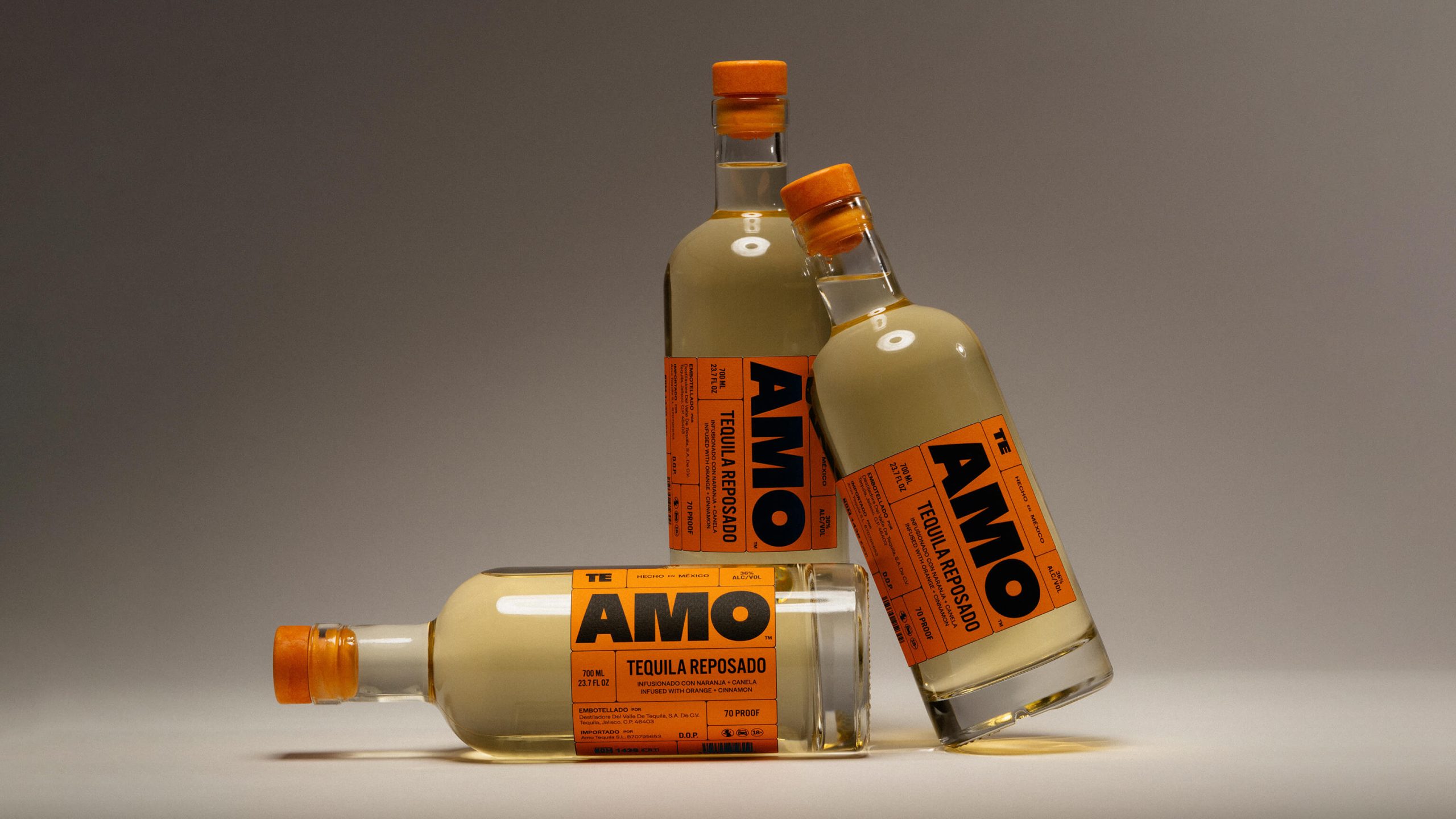
The packaging design for Ooma, created by Forner, is a blend of boldness and warmth, featuring a rich orange color palette that is both energizing and grounding, reflecting the benefits of the product.
The playful, chunky typography with rounded edges highlights the natural form of mushrooms, while providing a sense of comfort. The brand’s deeper purpose is to reframe mushrooms as a wellness tool rather than a novelty, and the packaging helps reflect these sentiments. Ooma’s logo and visual identity balance joy, creativity, and calmness, appealing to those looking for a holistic approach to cognitive wellness.
