ResearchandMarket.com anticipates that the global tequila market size will reach $14.35 billion by 2028, expanding by a CAGR of 5.4% over that period. Tequila has been growing increasingly over the last few years, driven by everything from the continued popularity of the margarita to a growing interest in sipping tequila.
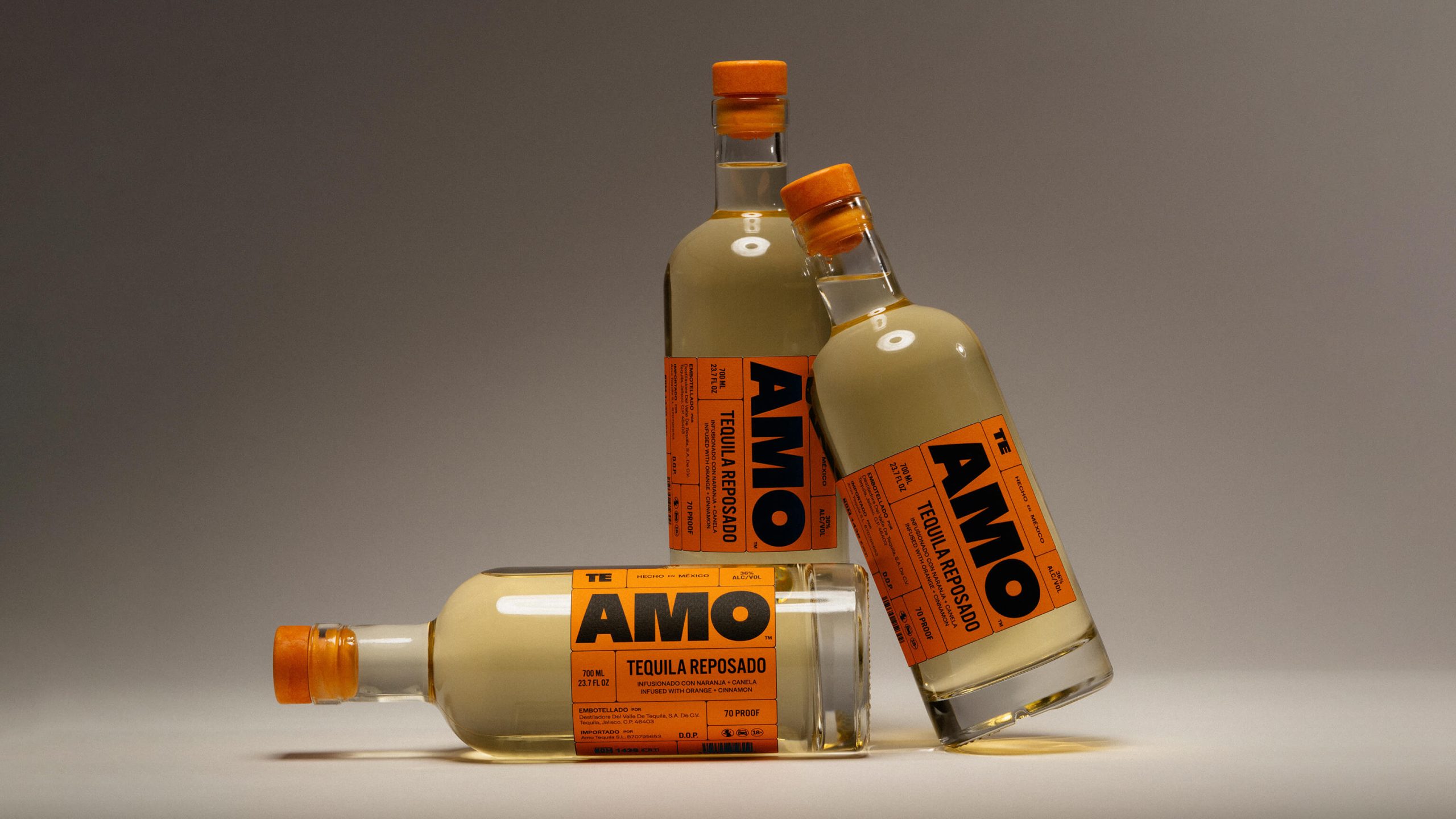
Our client, Fourth Wave, wanted to take advantage of this growth by introducing a new tequila brand that would combine both authenticity and innovation. The brand needed to look true to its origins in Mexico, but have a strong personality to carry off radical product innovation within the range. The range would consist of Blanco, Jalapeño and Extra Piquante Fuego Infernal – a wholly fiery tequila that would test the bravest of consumers.
The strategy behind the naming of Los Dias Magicos was to connect to the origins of tequila which, in Aztec times, was used as an offering to the gods. The town of Tequila is named “Pueblo Mágico” by the Mexican Government so the name Los Dias Magicos reflects both its history and place.
We developed the brand’s positioning to be based on the magical realism of Mexican culture, literature and art. Interaction with Los Dias Magicos would be slightly disturbing and unsettling for the viewer or consumer.
American artist Kathleen Neeley’s work neatly tied into magical realism found in Mexican culture so she was commissioned to create three unique art works. Each one brings to life the product in an unconventional, surprising and unsettling manner. In a category that is typically type-led, the use of these bold and intense illustrations creates a clear point of difference.
The typographic treatment is deliberately crude in its finish in order to look as hand-crafted as possible. Echoing the creative approach, the type is unconventionally placed: breaking in and out of the illustration as though there was a shift in the printing plates.
