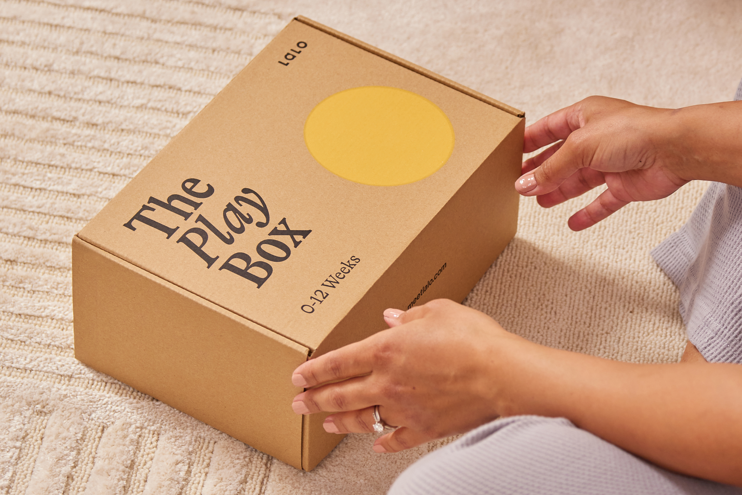
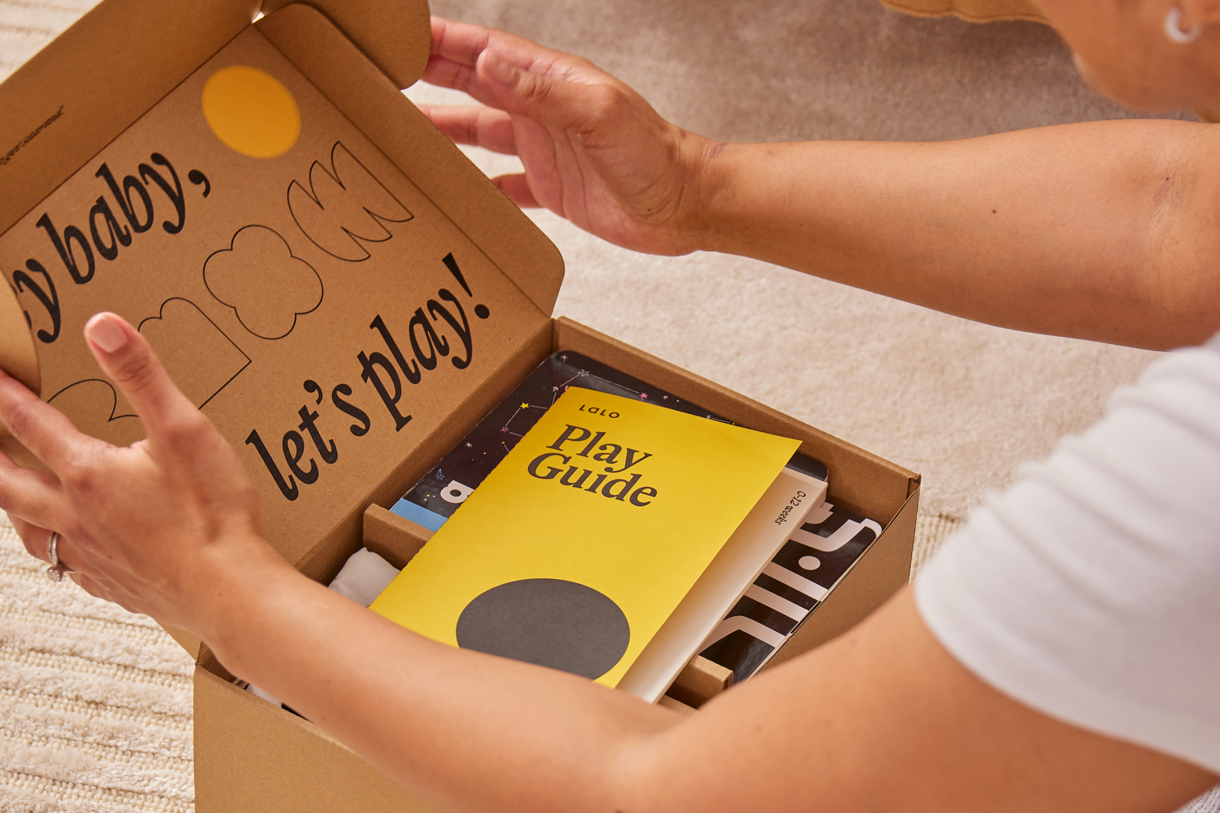
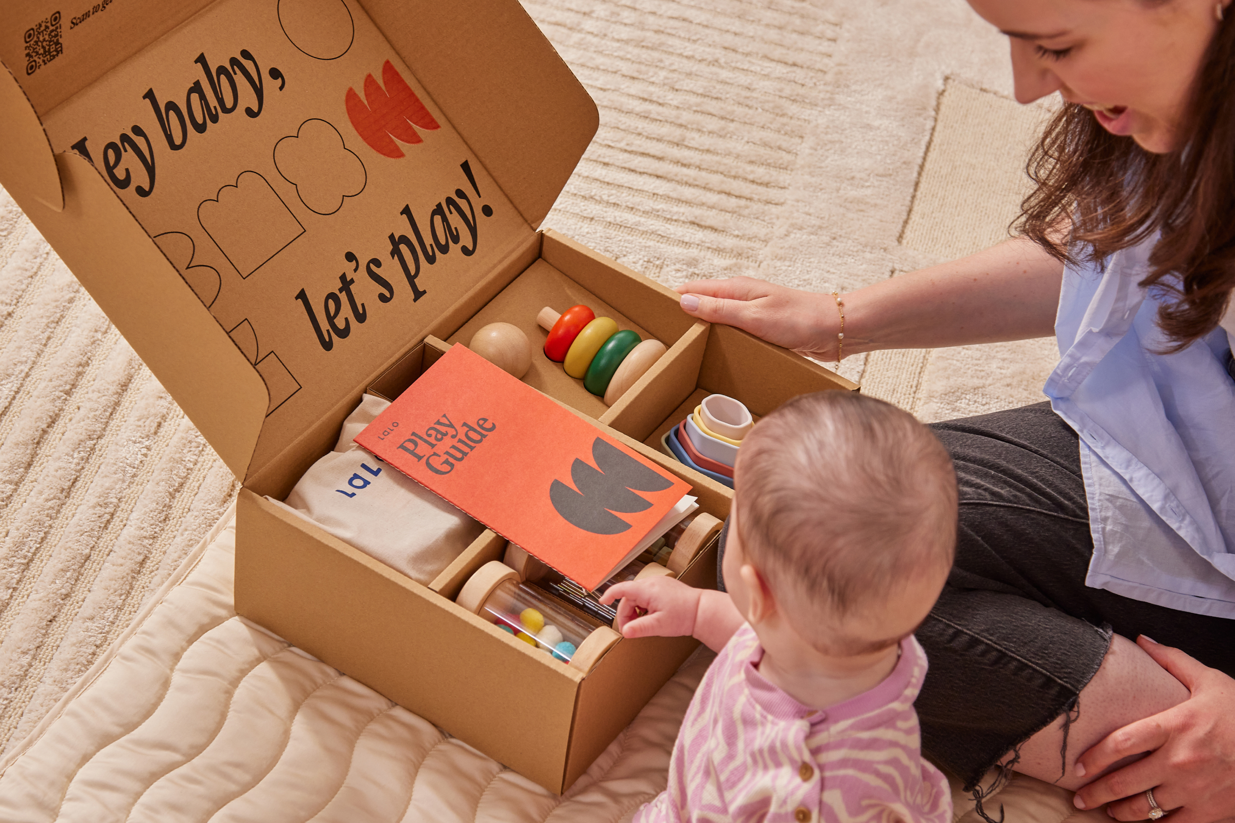
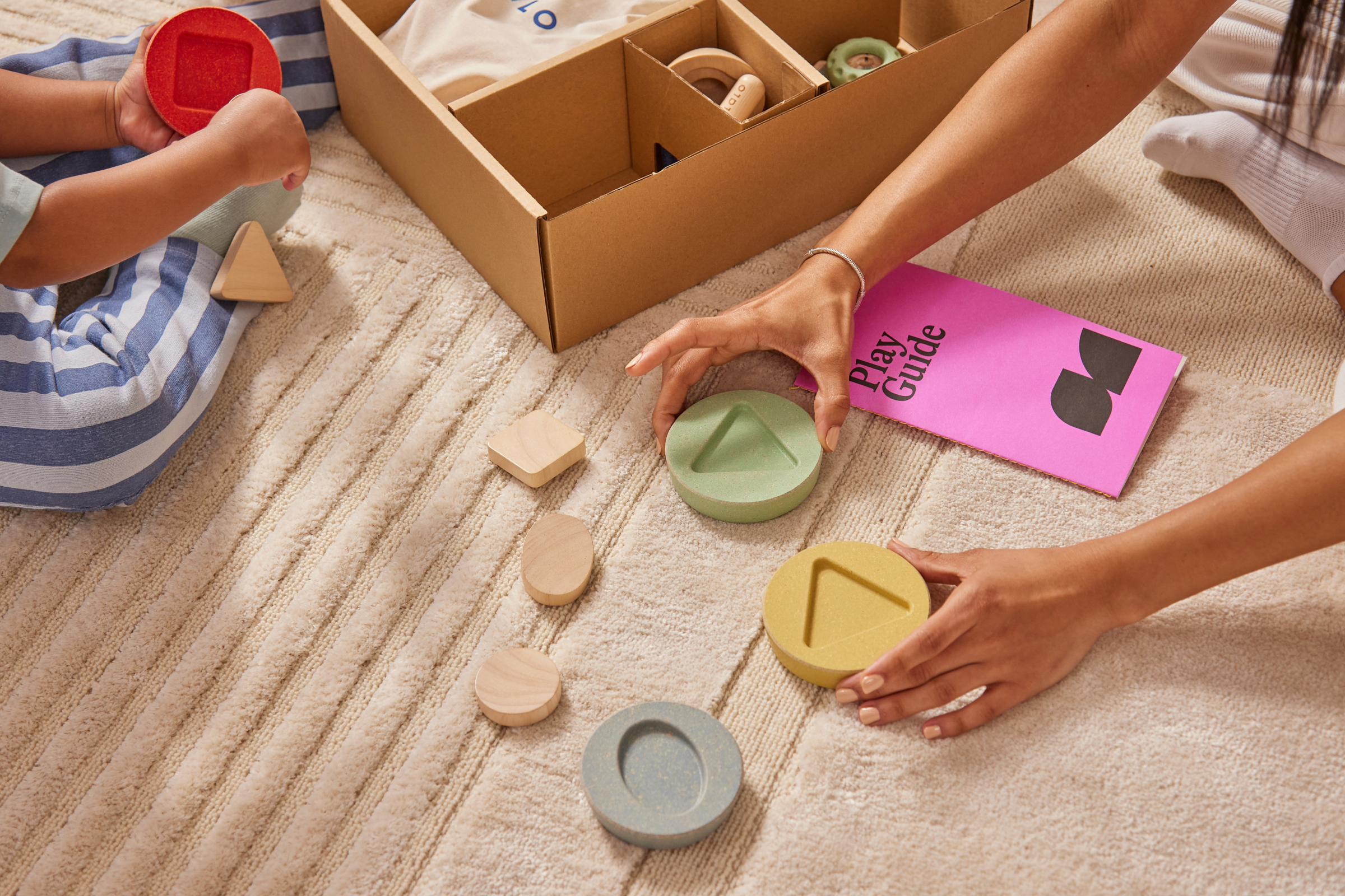
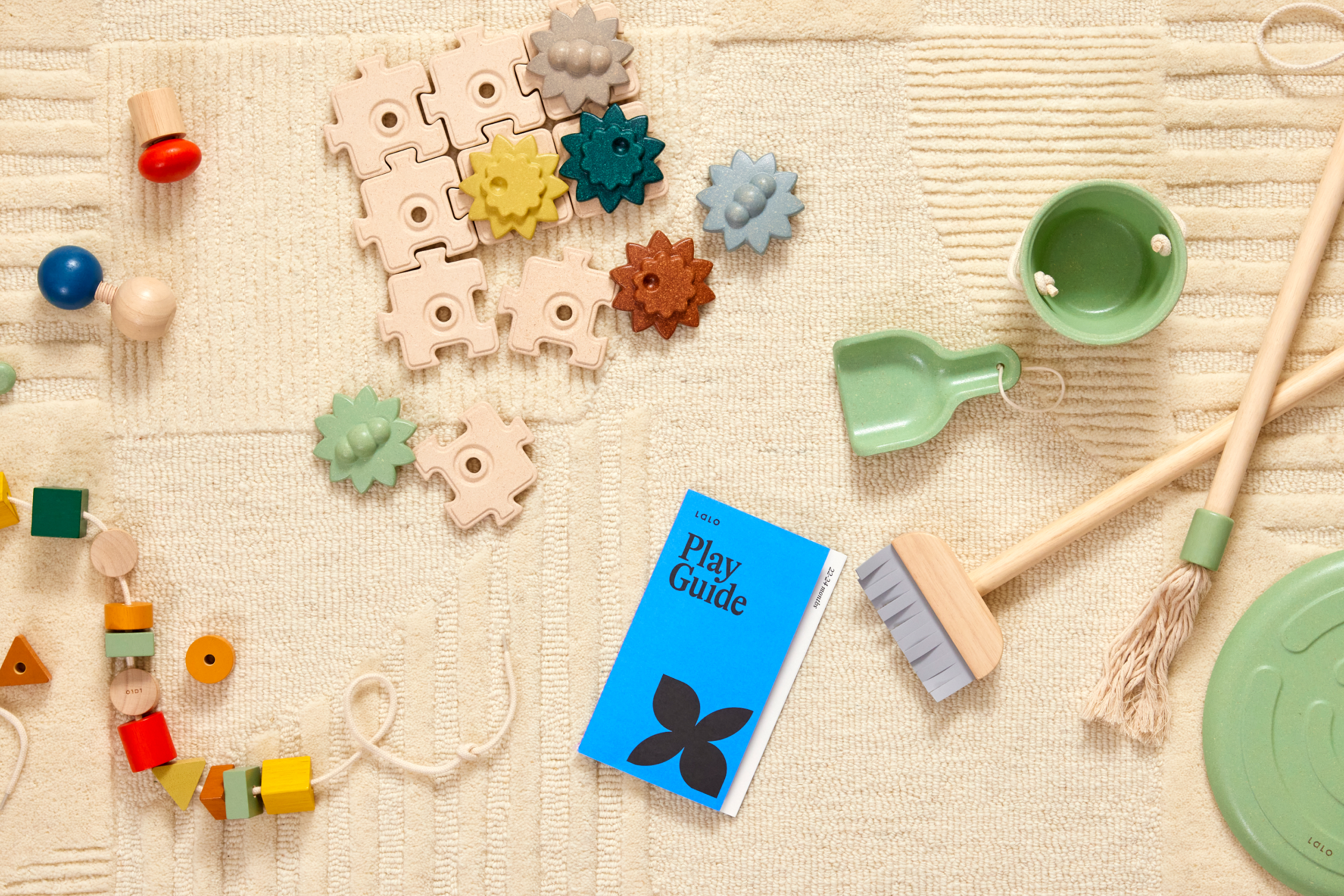
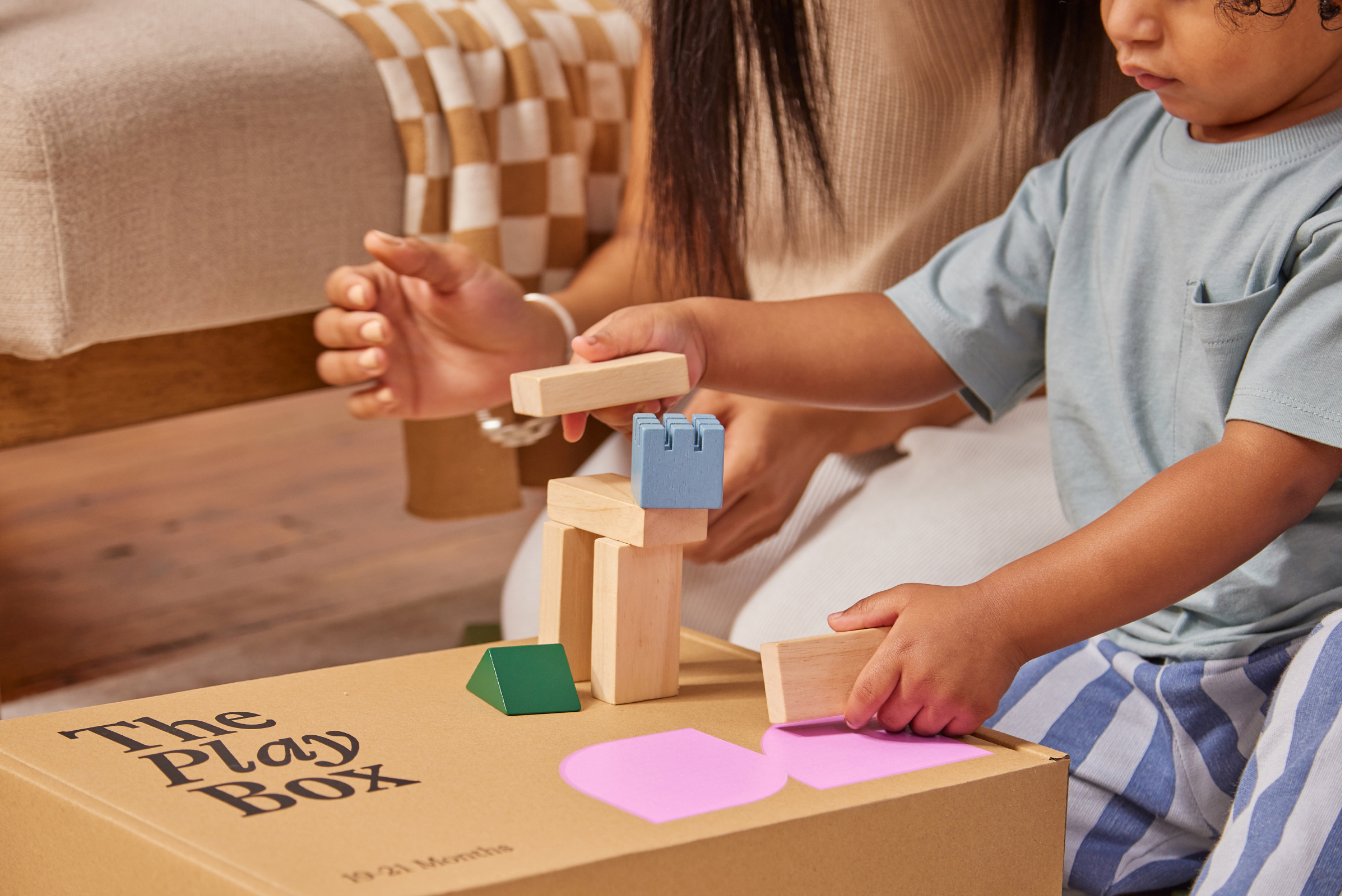
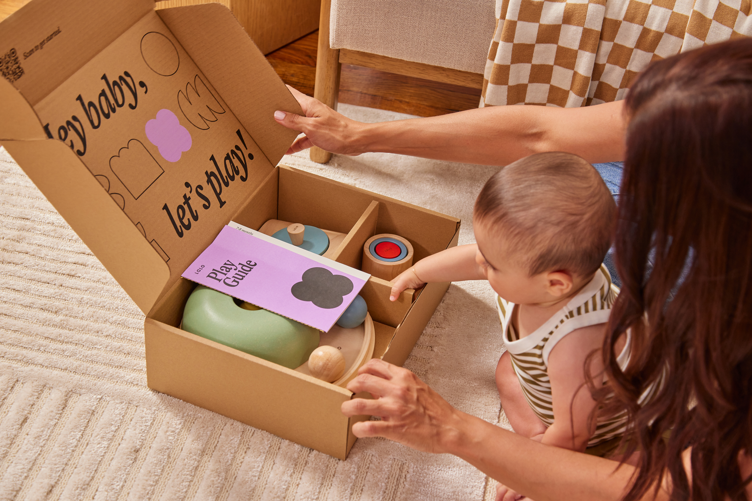
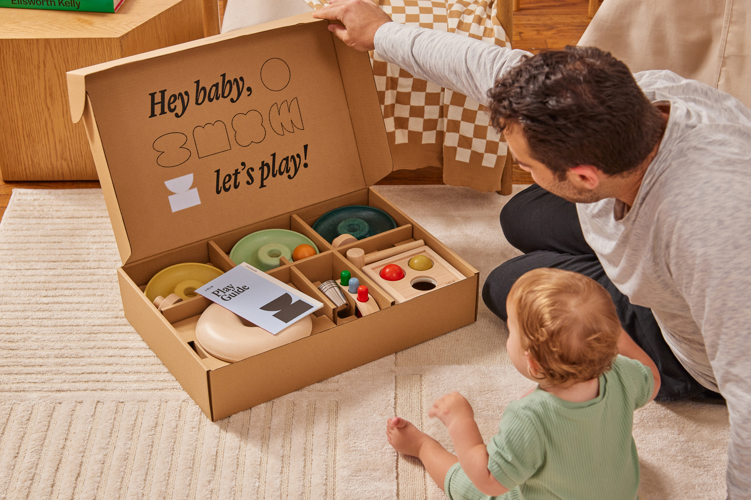
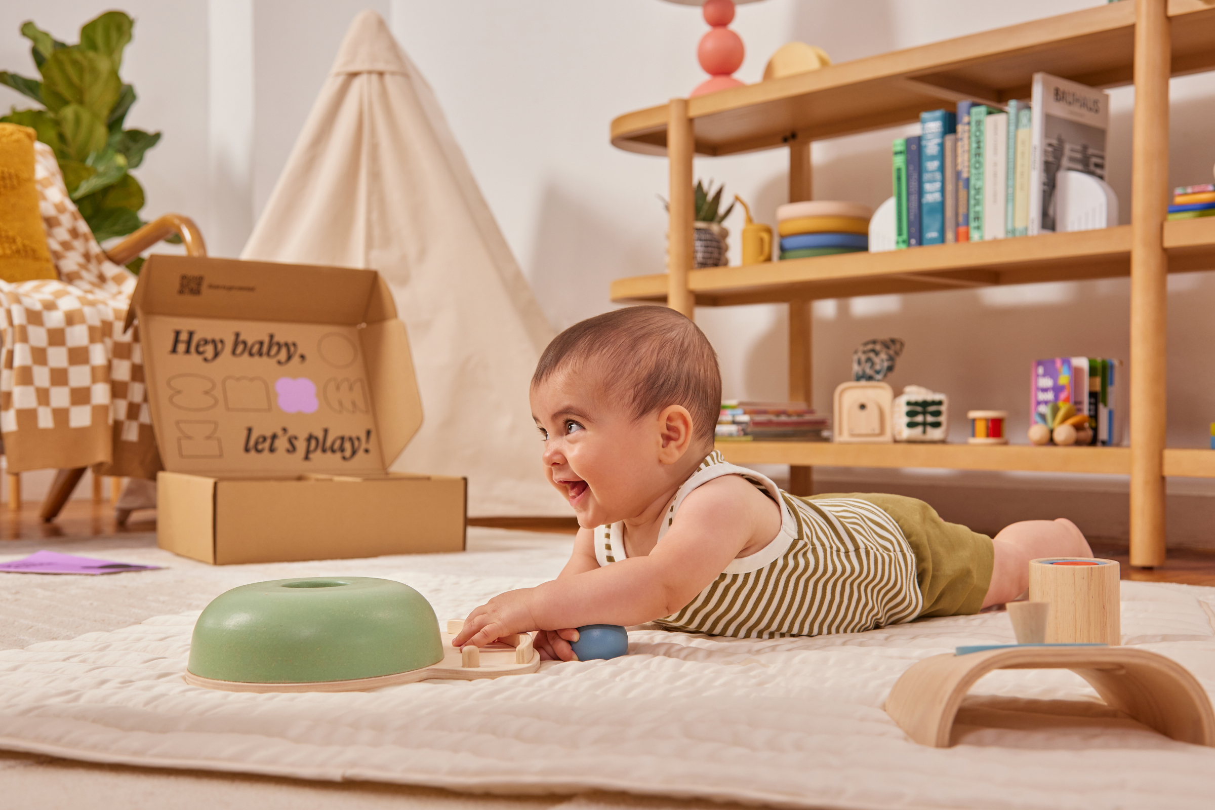
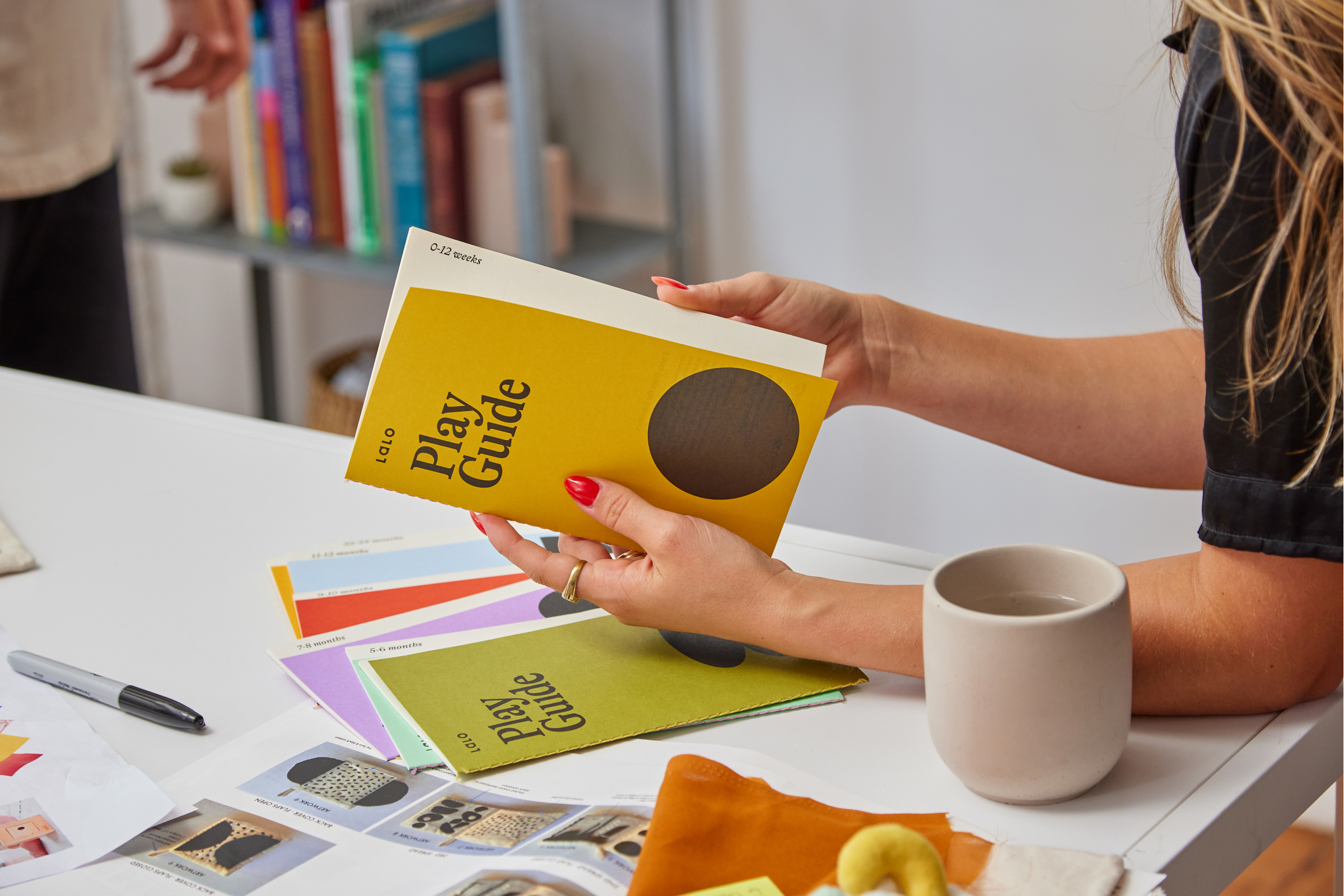
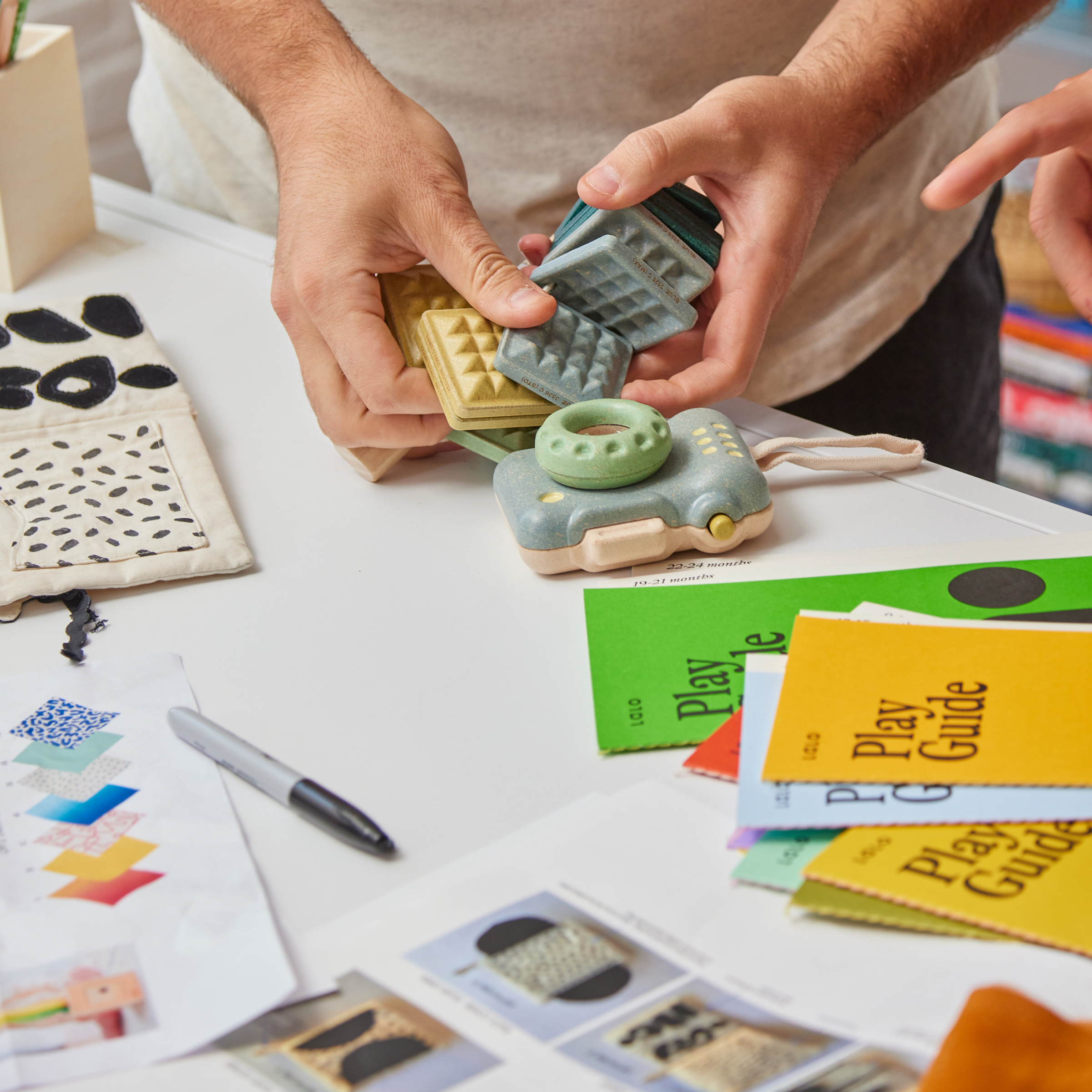
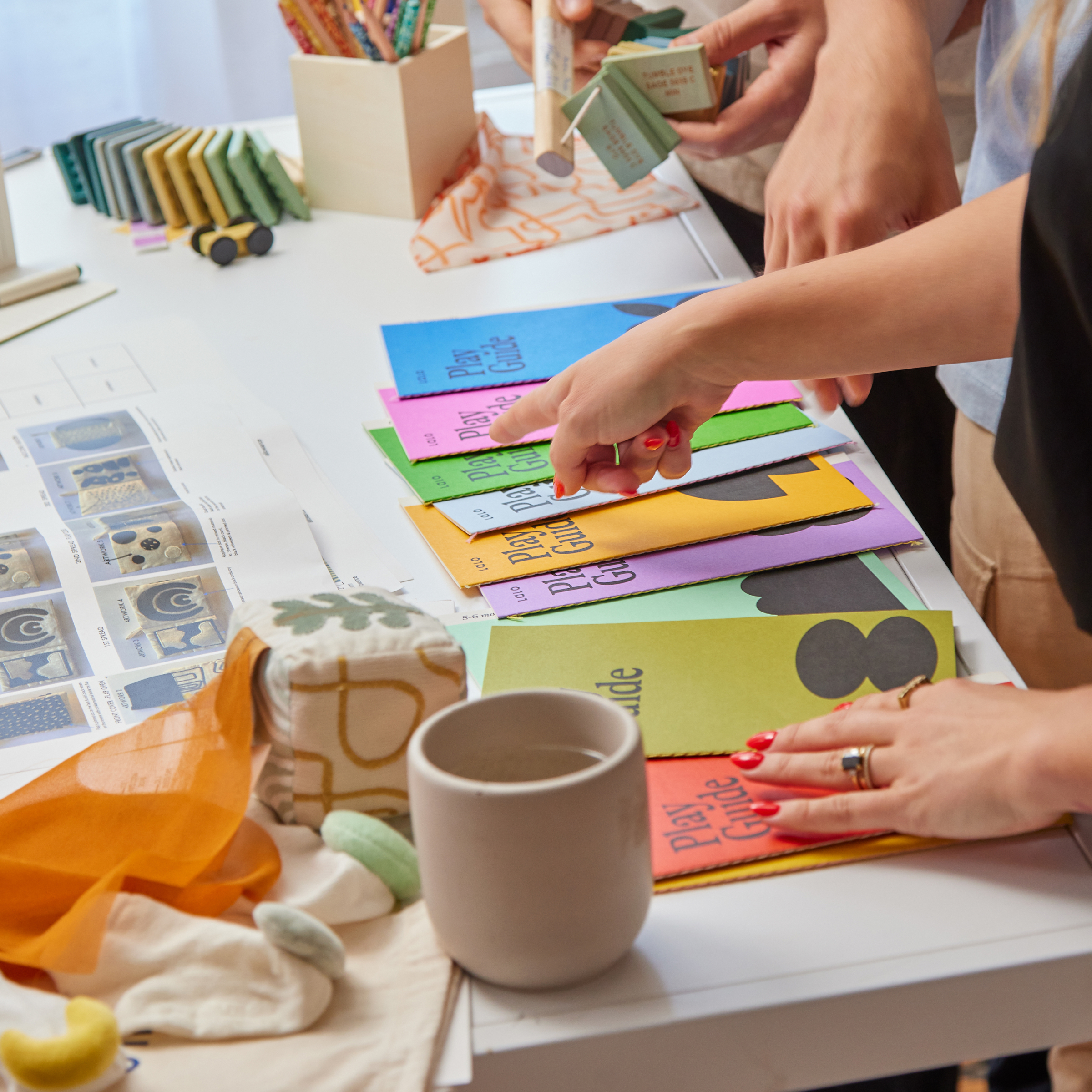
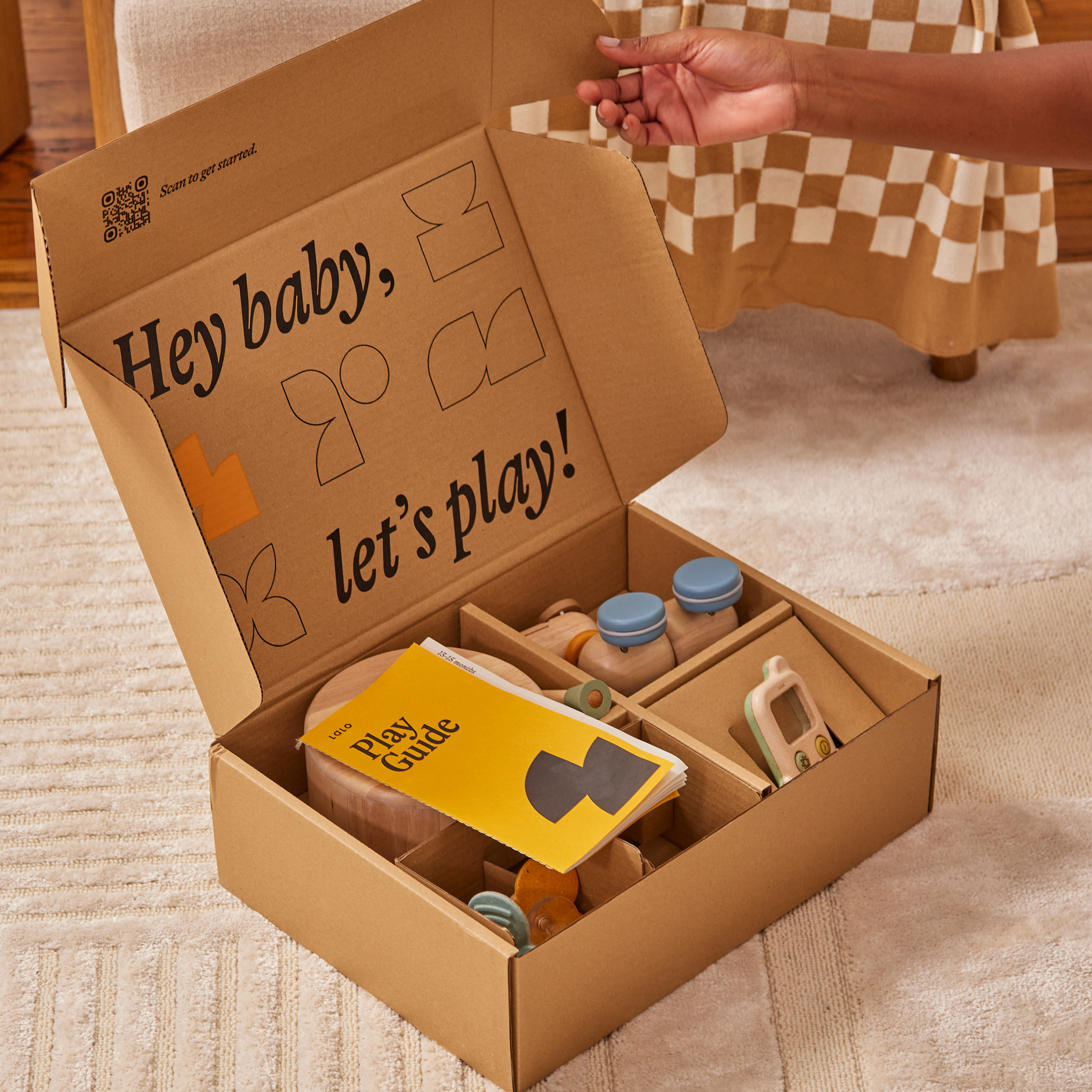
Courtney Wall’s design for The Play Boxes packaging transforms the educational experience for toddlers into a visually stunning and functional journey. Embracing a minimalist yet playful aesthetic inspired by the Bauhaus design principles, each box within the series of ten is marked by a distinctive shape and color, representing specific age ranges for little ones. The play guides accompanying each box share the same symbols and vibrant colors and feature meticulous details, such as contrasting thread colors in the saddle stitching, adding a thoughtful touch for parents. Lalo’s approach to this design ensures that while the inspiration comes from a child’s viewpoint, the execution considers the preferences and aesthetic sensibilities of the adults in the room.
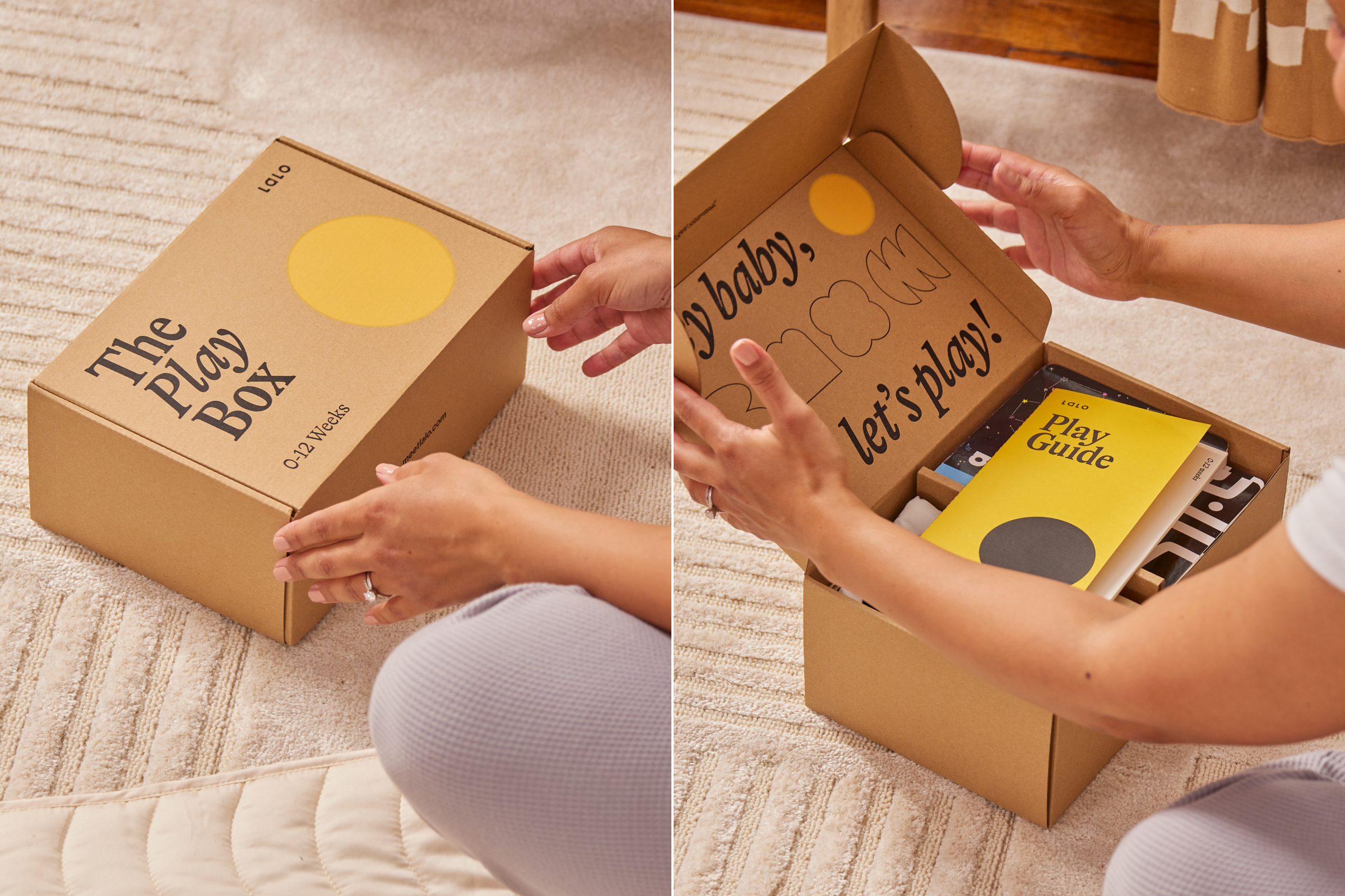
The Play Boxes are an expert-developed learning experience for your little ones ages 0-2 years. Each box cultivates their imagination and independence and your confidence and connection as a parent. Full of research-backed, sustainable toys these boxes are part of a subscription that can be delivered to your doorstep every few months based on your child’s age. They take the guesswork out of parent-led learning. About the design: Each box in the series of ten represents an age range for your little one that is marked by a single, bold shape and color. A play guide within each box sports the same symbol and bright colors to match.
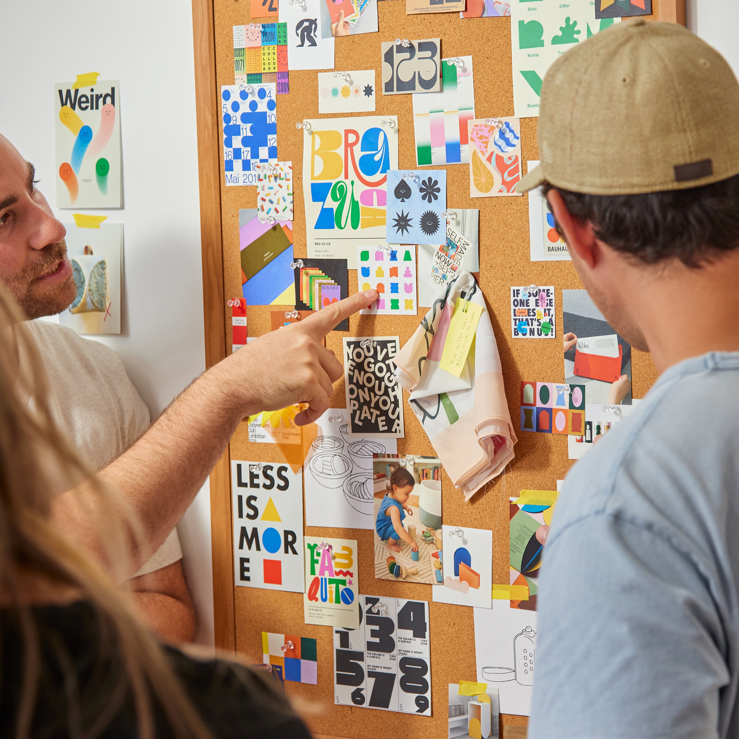
These 10 shapes are created from 5 base forms, when combined and/or skewed they from new shapes that comprise this system. The minimal, yet playful aesthetic is inspired by they key tenents of Bauhaus design, and the idea of looking at the world through a child’s lens; finding total wonder in the discovery of the simplest things. Lalo is a brand that makes kid’s products for the adults in the room, so while the design system takes inspiration from the eyes of a child, the execution of the design is created with parents in mind.
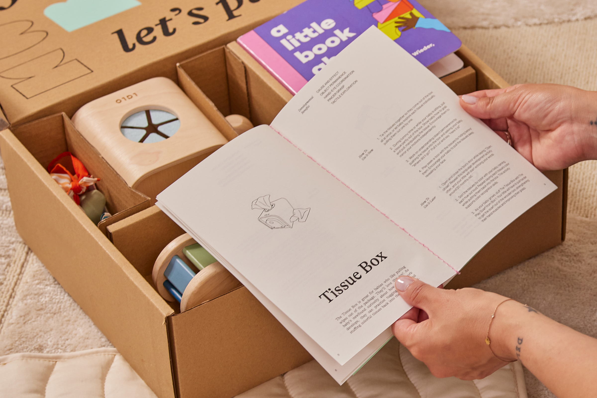
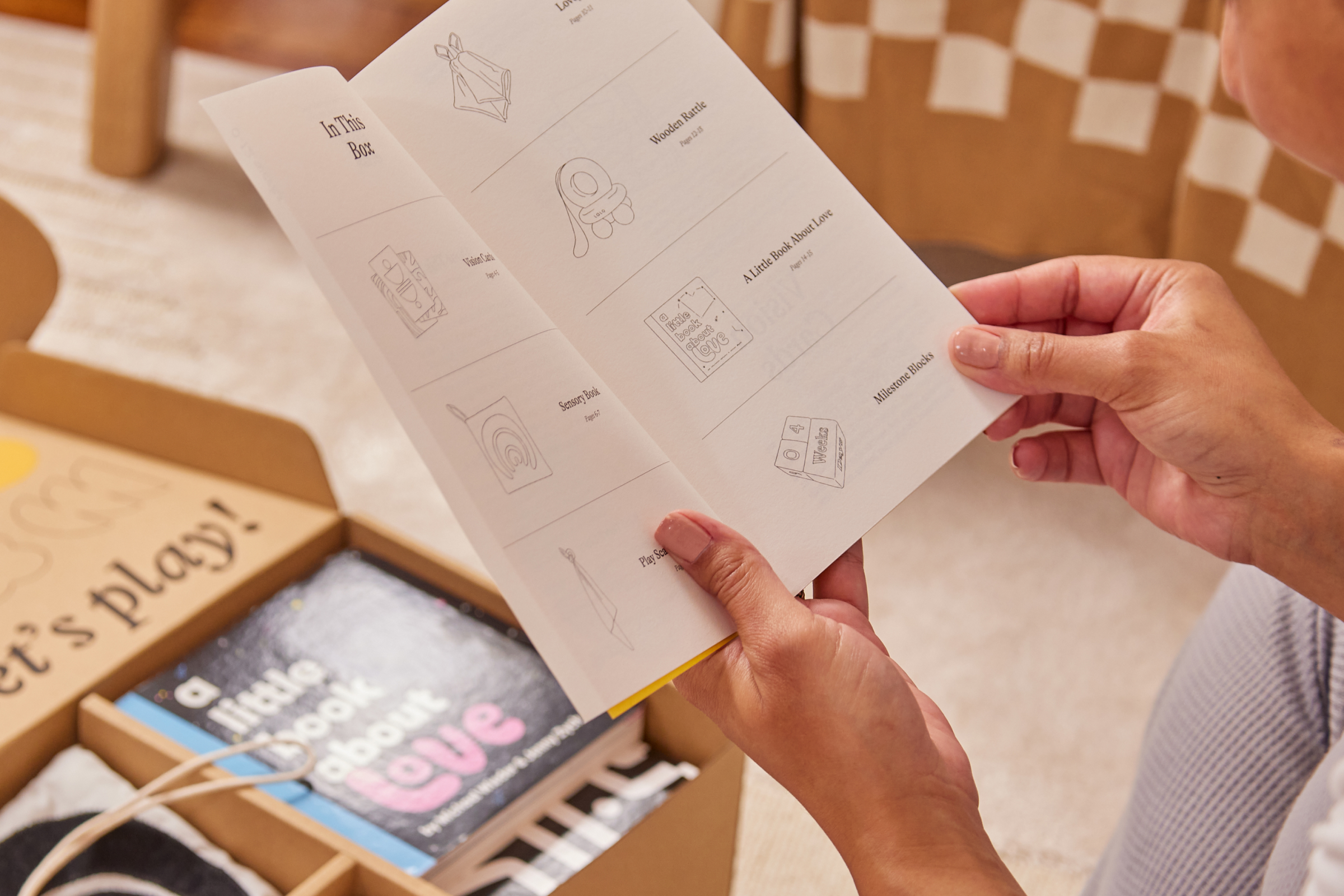
Some additional details not to be overlooked are the pop of thread color in the saddle stitching for each play guide– pink thread to contrast the yellow book, baby blue thread to contrast against the red-orange book, etc.) Rather than lean into a kid-like aesthetic the interior spreads of each play guide showcase detailed toy illustrations and refined typography. It’s a body of work Lalo hopes parents might be proud to collect on their bookshelf or coffee table over time.
