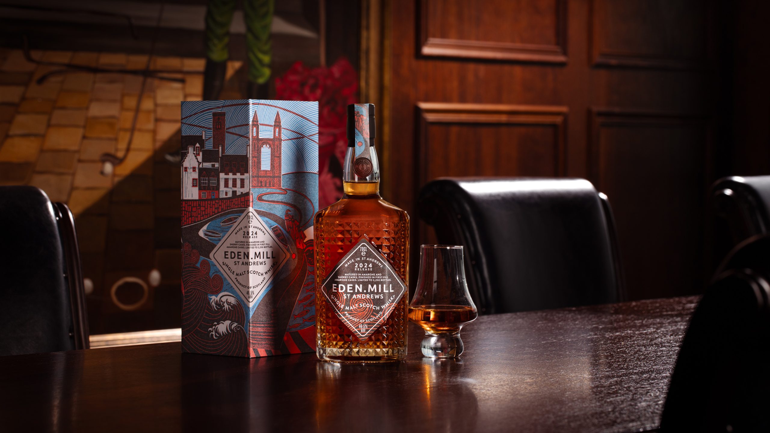
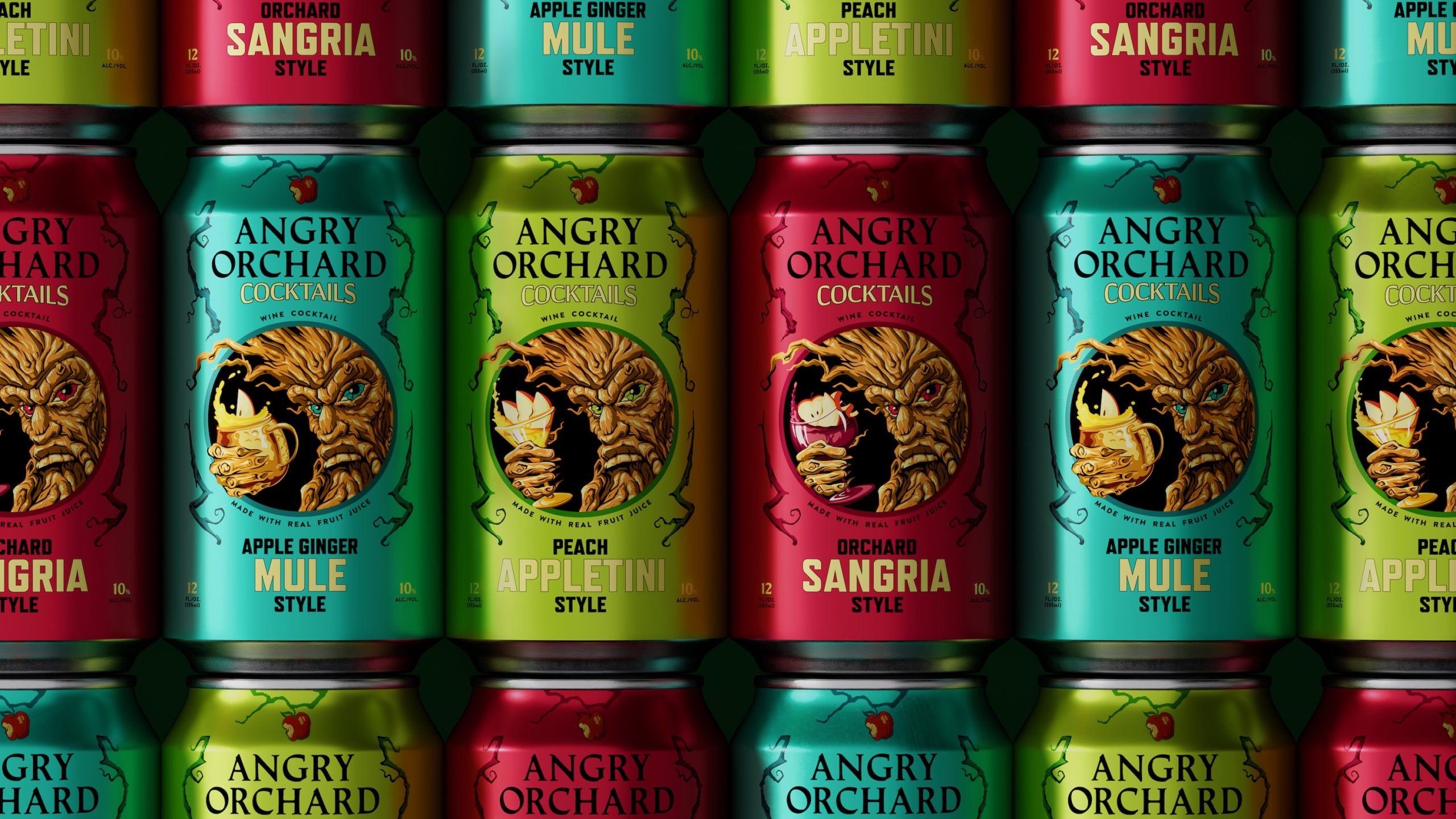
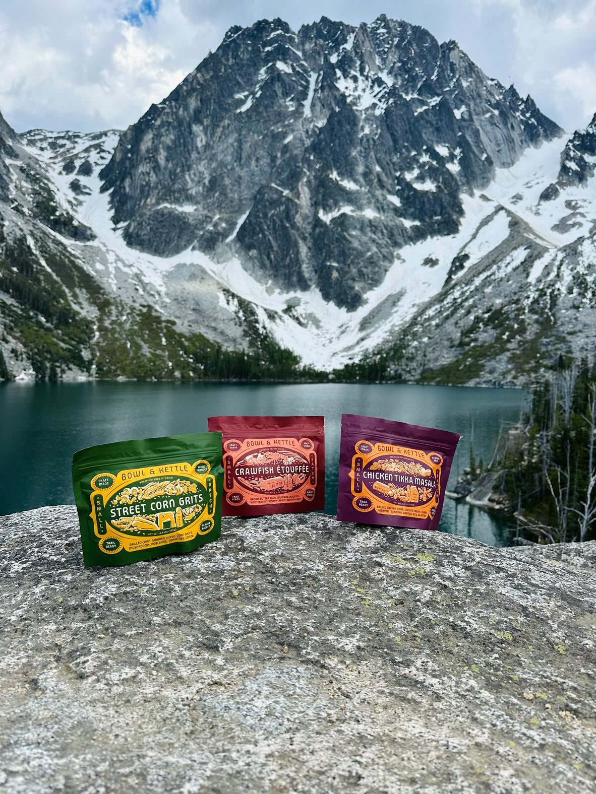
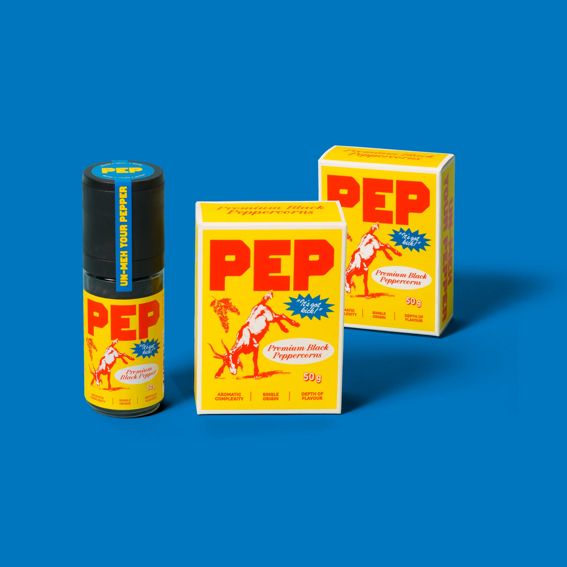
Who doesn’t love the smell of fresh play dough? Otherwise Brands recently worked closely with Little Larch to redesign its packaging system. From typography to iconography and illustrations, the packaging design for their signature Doughs, Glitter Doughs, and Potion Plays exude a playful and bold brand persona that instantly catches the eye on store shelves. The oversized typography, paired with the colorful, imaginative illustrations, creates an immersive system that’s playful enough for kids to feel inspired but approachable enough for adults to feel reassured. Little Larch’s dedication to sparking imagination, hands-on learning, and eco-friendly production methods truly sets them apart.
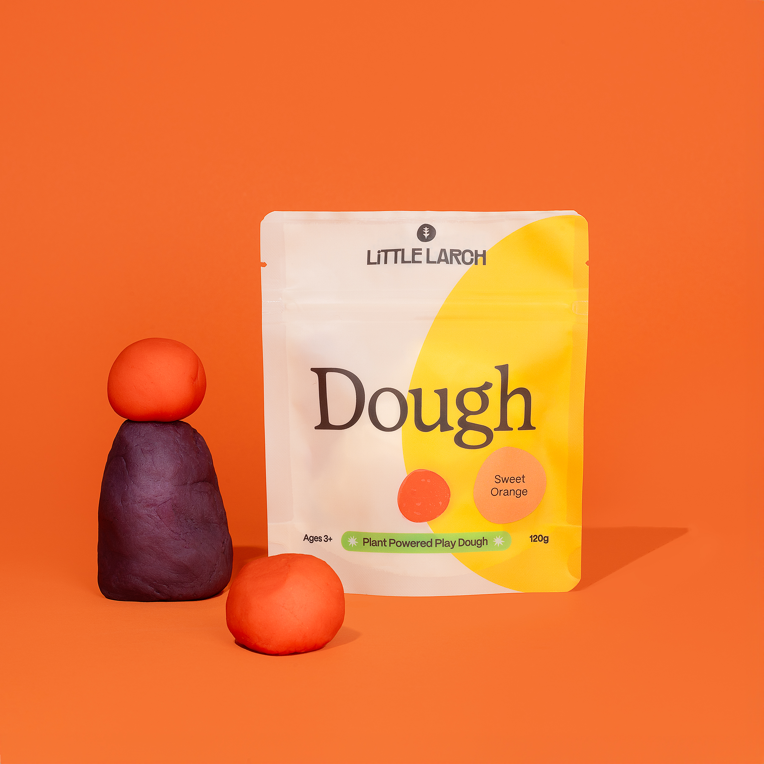
Little Larch is changing the game when it comes to sensory play for kids, with innovative products that are good for little hands, and better for the planet. Working closely with the brand’s founder, we developed a new visual and verbal identity to match the company’s goals and ambition: to expand outside of Canada and become a household name in the industry.
