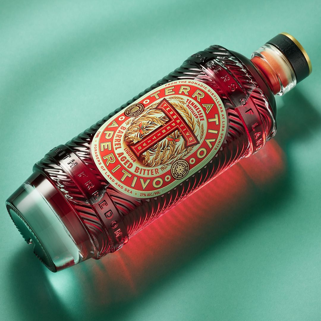
The packaging design for Hiotissa, designed by ruto design studio, draws heavily from local Chios traditions, featuring an elegant logotype with characteristic long “tails” on the vertical strokes inspired by a local artist’s signature, creating a sophisticated historical reference without feeling overly heavy.
The label incorporates traditional lace and embroidery motifs, with a unique paper that changes opacity at certain temperatures, allowing light to pass through and imitate lace holes, further enhanced by embossing, foil printing, and a custom wooden cap designed to resemble traditional hats.
