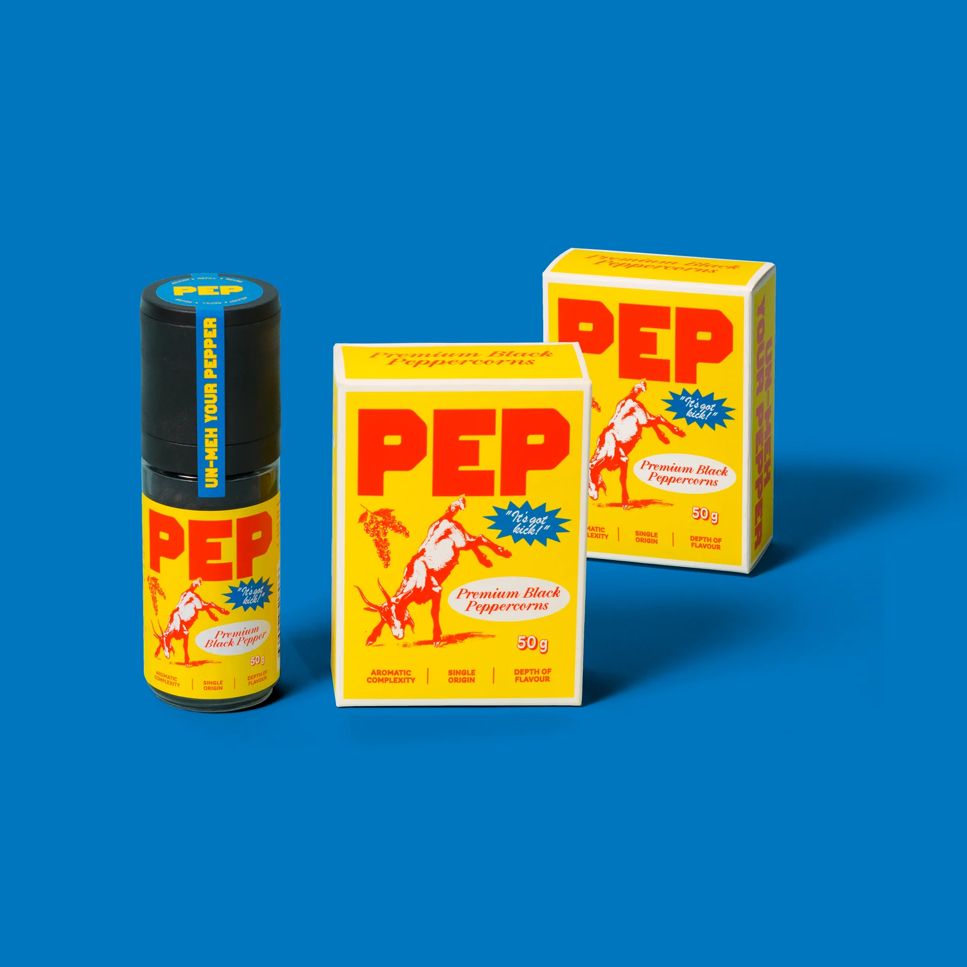
The wine packaging for “Andrew” is centered around a vintage matchbook-inspired label that feels effortlessly nostalgic. Inspired by pop art photography, each label captures the worn, lived-in feel of collected matchbooks.
The name “Andrew” is custom-typed to appear naturally aged, as if it’s been pressed into the matchbook over time, adding a timeless element to the clean design. The simple sans-serif “Andrew” wordmark balances the vintage aesthetic, creating an approachable design.
Below, Jose Garcia, creative director of Zoca Studios, sheds some light on the behind-the-scenes process of producing a label with a beautifully worn-in look and feel.
