In the history of The Dieline Awards, we’ve never had a studio dominate the way Wedge did this past year. The small but mighty Montreal-born agency and our clear Studio of the Year winner broke the record for the most awards ever received by a SOTY, claiming nine awards across a range of categories, from health and beauty to food and beverage. It was a full slay, as the kids say, as their packaging and branding design for Omy Laboratories, Paro, Cha, and Festif were each given their much-deserved flowers.
To honor and celebrate their design supremacy, we recently chatted with Wedge co-founders Sarah Di Domenico (Co-Founder and Chief Creative Officer) and Justin Lortie (Founder and Chief Design Director) about their big wins and the projects that brought home an army of Ds.
I don’t see Wedge as a packaging agency. That’s limiting. For us, these are things that are part of the brand world-building that we do. The packaging is almost like an artifact from that world, that’s how we think about it. There’s so much brand building behind that box or that can or whatever it is. We work hard for founders and companies to define that distinction that creates their magic.
Sarah Di Domenico
How does it feel winning Studio of the Year and breaking the record for most awards ever received by a SOTY winner?
Sarah Di Domenico: It’s a really great acknowledgment of the team. It’s always nice to have a reason to celebrate with the team and for everyone to feel very proud. It also depends on who’s sitting on the jury, so thank you, jury!
Justin Lortie: We’re not 500 people, nor 100 people. We’re a small team, and we’re very precise with every step that goes into the projects. It takes a lot per project, so to have multiple projects recognized, it’s really the accumulation of dedication over a long period of time across various projects with a very small team.
The projects Wedge has been recognized for cover a range of categories. Can you talk about how you navigate that as a small studio and how your approach does or doesn’t change in different categories?
SD: It’s part of our mission to keep diversifying and to touch a lot of different categories. If you look in the studio, we’re working on all kinds of stuff, like single-use, plastic-free home care, baby care, and oral care, and we’re starting to work a little bit more in audio electronics. We call our process “The Wedge Way,” and it’s the same no matter what we work on. It’s so fun to apply the methodology to many different spaces. The broadening of categories represents a constant commitment to learning, growing, and curiosity, which are massive values in our culture.
JL: Our early debut was more food and beverage, and that’s something we were known for, but we were intentional not to be a one-trick pony. We always push to reinvent how we do projects. While they’re anchored in a similar methodology, the outputs are very different. It’s funny to see how each project feels like there’s a different company behind it, and it’s intentionally done like that. We’re not trying to sign them all with the same signature.
Can you unpack the Wedge ethos, “Everything can be special,” for me? What does that mean to you?
SD: It’s very much reflective of the optimistic lens we apply to everything. Back when I was working in global advertising, you’d get a brief, and some folks would react toward it and say, Oh, I don’t want to work on that. But at Wedge, our collective mindset is that we will find that little bit of magic. “Everything can be special” can apply to any category. It might be a seemingly unsexy thing, but it’s really important to use that lens because it helps us see beyond what it is, see beyond an archetype, or just think about it differently.
It’s about broadening the aperture and bringing a different sort of mindset to something that can seem mundane but actually can be so interesting. I don’t want to do the same thing I did for someone else. We love that constant challenge; it’s part of what keeps our ambition alive for what we do.
JL: When we started, packaging felt less cool than it is today. But now, through The Dieline, there’s such a huge community, and kids can go to school and see that packaging is cool. It didn’t feel like that 5 or 10 years ago. It comes back to that line: “Everything can be special.” We started seeing interesting ways to rethink ordinary packaging in our lives. It became a natural way of working for us, seeing potential in these everyday things.
That’s also why we’re pushing to expand categories today because it could be stuff for cleaning your house or screws for your garage. Everything has the potential to become exciting in its own unique and distinct personality.
SD: I don’t see Wedge as a packaging agency. That’s limiting. For us, these are things that are part of the brand world-building that we do. The packaging is almost like an artifact from that world, that’s how we think about it. There’s so much brand building behind that box or that can or whatever it is. We work hard for founders and companies to define that distinction that creates their magic.
Let’s get into your award-winning projects! Starting with Omy Laboratories, which won Editor’s Choice, 1st place in the Health Beauty and Body Brand Identity System category, and 3rd place in the Beauty and Cosmetics category. What was it like developing a completely recyclable refillable system for Omy?
SD: Behind every project we do, there’s always a tension guiding how we design something. For me, one of the most exciting parts of it was actually landing on the tension between something that was very science-driven because that’s who the founders are—a chemist and a cosmetician—and the desire to hit it with something that felt very human and warm at the same time. Those things are in total contrast. But when we started building the narrative of “skincare formulated to evolve with you,” that was the bigger idea that unlocked everything.
It was exciting to work with a founder who was so committed to creating a refillable system. It’s not super common for people to make that commitment, so it was this massive opportunity to be thoughtful and involved so deeply in the details to really think about how that works.
JL: Behind every great new brand are usually great entrepreneurs; there would be no brand otherwise. What was so ambitious from these two women who founded Omi, Andrea and Rachel, was that they created a vertically integrated plan where they controlled the manufacturing from A to Z. It was bold, it was ambitious. Many cosmetics or skincare brands are outsourcing production, but they decided to master and own it.
The packaging became an extension of their internal processes. We created a labeling system that would be printed at the factory with the unique code and formulation of users, so everything is centralized, everything’s happening in one place, versus outsourcing the manufacturing, shipping, and distribution. The brand packaging was directly tied to the business operations.
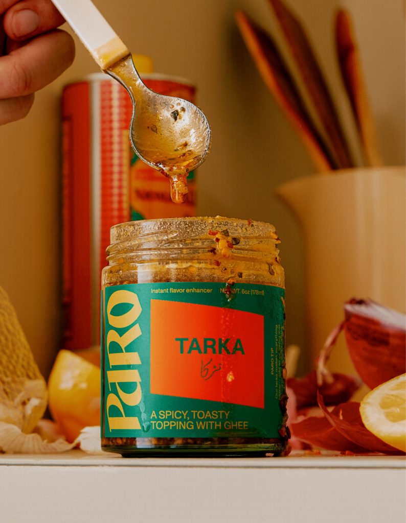
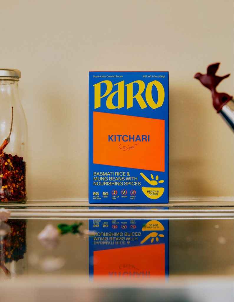
Moving on to Paro, which won 1st place in the Startup Brands category and 3rd place in the Ready to Eat/Meal Kits category. How did your team go about designing their branding and packaging?
LD: This one is so different because it starts with a different challenge. The challenge was introducing Pakistani food, which, generally speaking, most people have never heard of or maybe tried. So creating a sense of familiarity was the first way in; it had to bridge the gap between this food’s heritage and the fact that it comes from someone’s mother’s recipes, and then bringing that in a modern way onto the shelf for an audience that may have never heard of these products.
We tried to bring a sense of familiarity from the product but then break that tradition. Uma, the founder, is from a new generation, so she’s getting a new lens for a new audience—this is why the design feels a bit more modern. It’s bridging both extremes.
SD: Uma is American, but her parents are from a different country. Paro is culturally inspired, but this idea of the “ethnic aisle” is so aged. We wanted to land on a result that felt so of the now but referenced something true.
LD: And it’s subtle. The logo is calligraphic and reminds you of something it’s not, so it doesn’t reappropriate the code. Then, the colors are super vibrant and reminiscent of the past, but they’re done in a modern way. We often talk about our cultural forging when we do these types of projects, which is leaving the internet or going into areas of research where we try to find inspiration within the category from the outside. Paro was a testament to that, not just looking at what’s happening with CPG products today but also looking back to the origin and source of where we’re coming from.
Your Cha design won 1st place in the Tea and Coffee category and 2nd place in the Functional Beverage category. What was that design process like?
SD: Ashley, the founder of Better Booch, approached us with a new vision for a new product and needed us to develop the brand and packaging. We weren’t constricted by Better Booch at all. Technically, it’s a Better Booch product, but it’s completely different. I love working with Ashley because she has good taste and is very clear about her inspiration for the product. She can talk about the why behind it and how they made it. Their product strategy is really clear, so we can take that clarity and translate it into design.
With Cha, it was interesting because, when you go into the beverage aisle, choice paralysis is real. Ashley said I don’t want to be another bold, colorful, in-your-face Poppi. It’s tea-inspired. I want to be elevated. So, we translated all of those intentions into design.
JL: It was the opposite of Paro, where, with Paro, no one knows what this food is, and then you go into sparkling drinks, which are so saturated, so we had the opposite problem to solve. There are so many cans of everything!
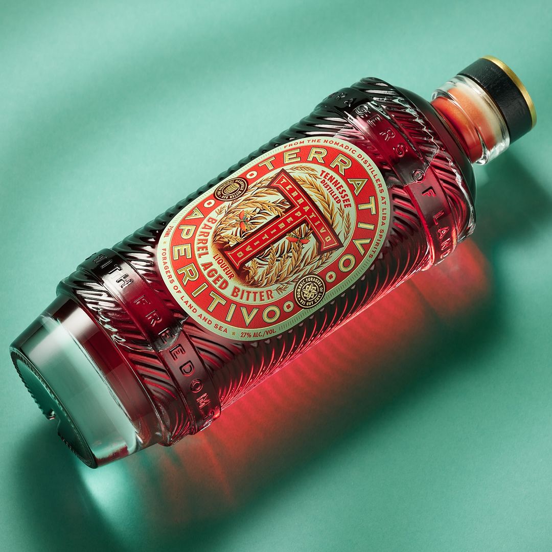
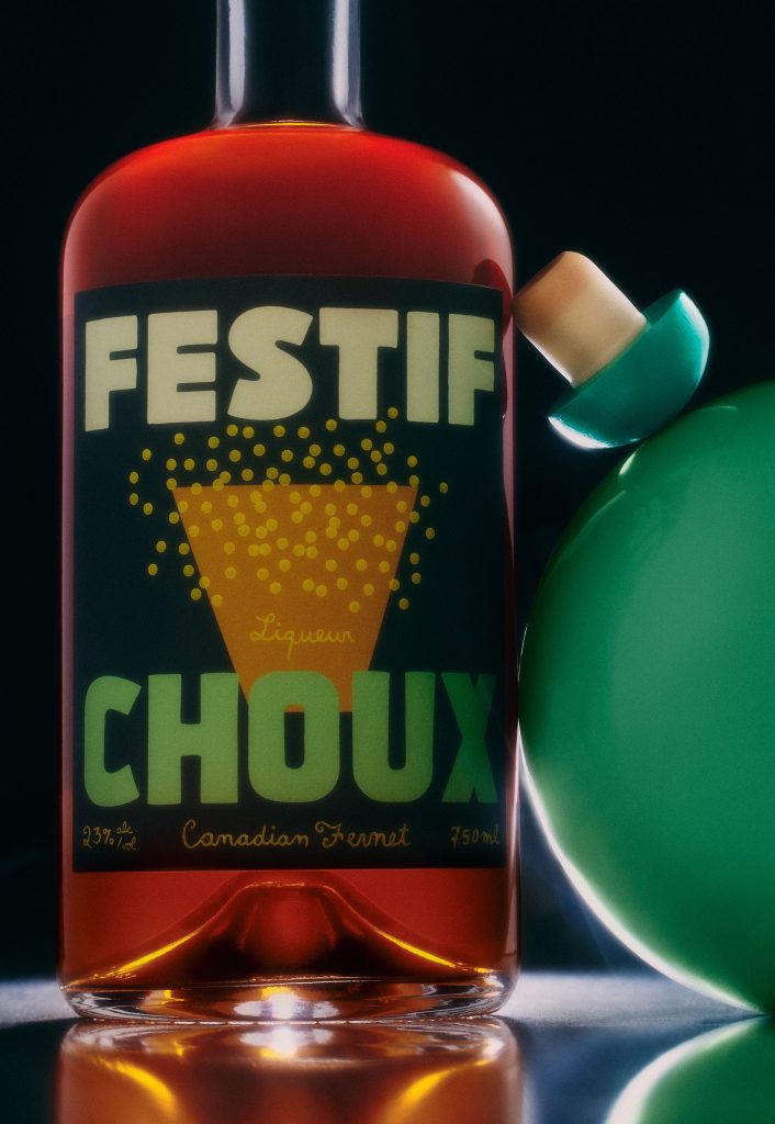
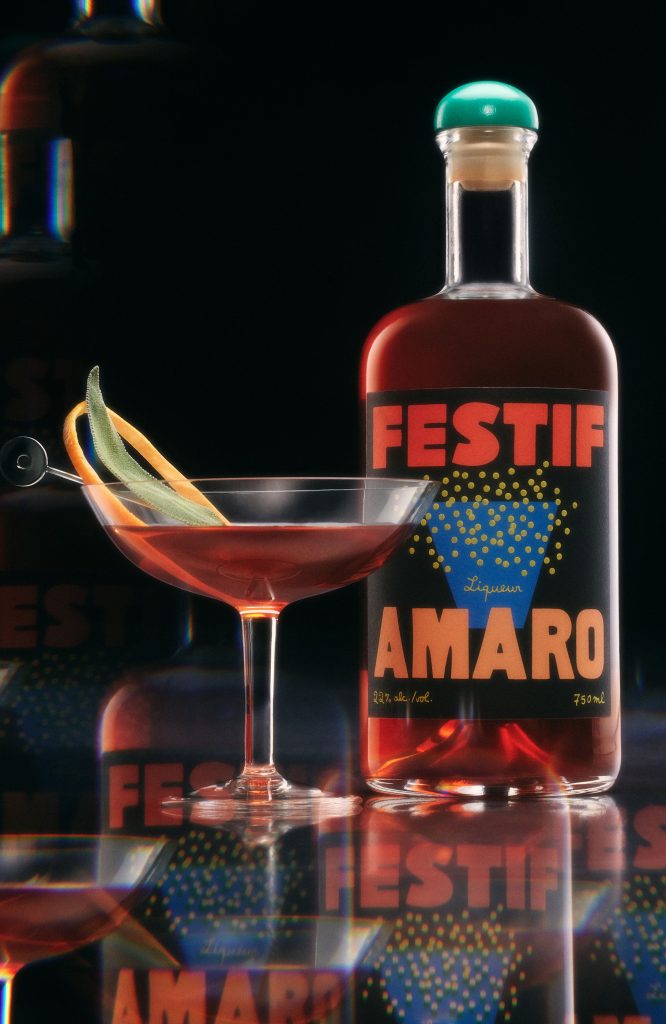
I love what you created for the Festif bottle, which took 1st place in the Dark Spirits category. How did you all develop that wonderful bottle and label?
JL: Festif had to be as delightful as the founder’s vision. This guy is obsessed with aperitifs; he’s been crafting recipes for almost two and a half years. So there’s so much passion and obsession in the bottle, and the design had to translate the passion of the product. The bottle looks so good on the shelf; it’s delightful and a nice object.
It has the quality of having Canadian ingredients and is made in Los Angeles, but it’s also rooted in Italy, so it’s all these blends of references to create something that feels like it’s been here, yet it’s new. That’s a good feeling. We talk a lot about intuition and how emotions are important when we design, and this is one project where those variables were significant because it’s about that intangible quality of feeling something.
SD: If you look at all of the packaging for these projects and then were to meet the founders behind them, you’d be like, Oh, it makes sense that that was the result. When I look at Festif, it’s the founder, David’s, joy. The way that label lights you up and what that brings to the dinner table. When we started the process, he had a vision for the product, but he had no idea what the branding would look like. He brought all these photographs of a table after a great meal— you have these empty cups, and it’s a little bit messy, but it’s the feeling of a good time. I was like, well, no wonder you called your company Festif! It’s that magical spirit.
Obviously, all of these projects are distinct, but can you identify a common thread that extends through each one?
JL: They all reflect their positioning, intentions, and point of view very well. They do that very successfully within their category and within the strategic direction the founders intended for the products. When we say, “Everything can be special,” it’s tied to us translating a business idea into a brand, a world, and a product, by extension.
SD: Craft is extremely important at Wedge. We have a value that high-level craft really counts, but not perfect answers. Looking at all four of these projects, there’s a very high sensitivity. They’re all very distinct in what they aim to do, and that’s our ultimate goal no matter who we work with. There isn’t one project in that line-up of award winners where you can say it’s a trend of something, and to me, that’s when it’s a capital-B brand. There’s branding, which is doing logos and colors, and then there’s brand building, which is creating a defined world. That’s what we’re really proud of.
