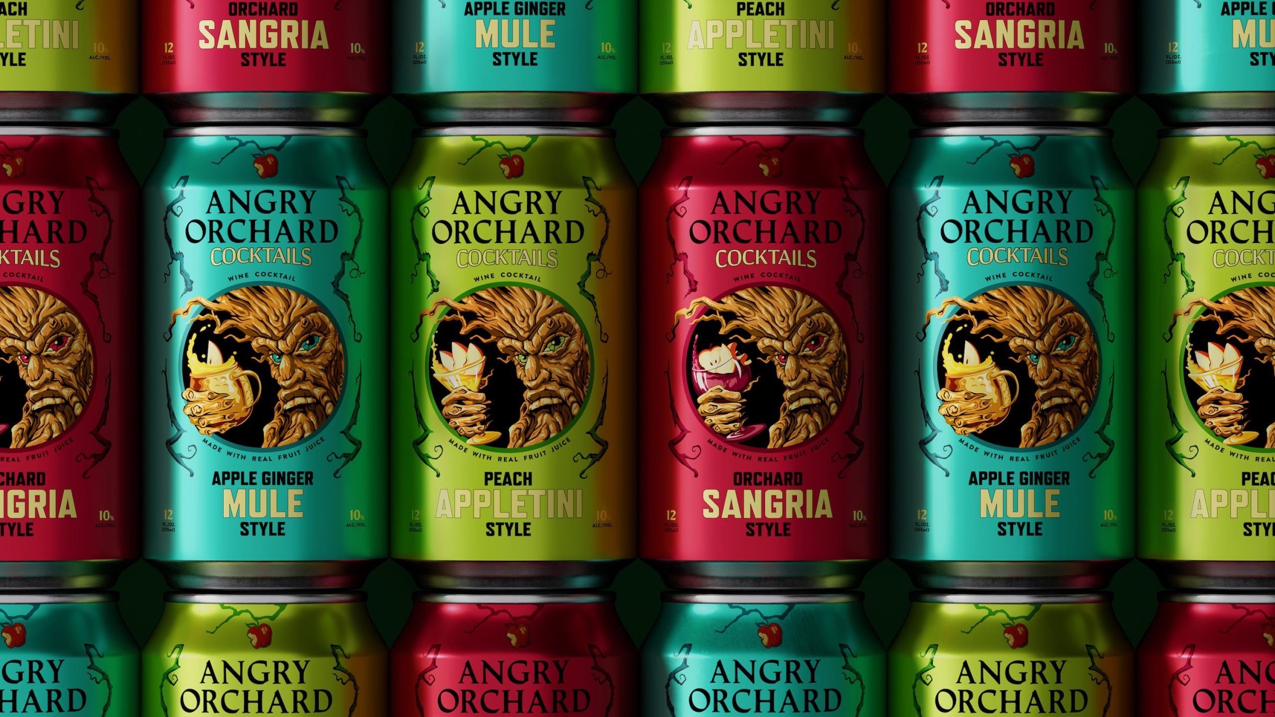
Thanks to their accessibility, sustainability, and classic vintage aesthetic, there’s something timeless about cans, but they’ve felt especially hip lately. Recent takes on the trend have leaned into a cool high-low vibe with opulent, upscale design touches to the everyman packaging, one example being Auge Design’s immediately eye-catching work for Casa Marrazzo. In their hands, canned food becomes a goldmine with vibrant jewel toned labels, bold, gilded sans serif typography, and a slender, classically Italian wordmark.
Casa Marrazzo’s can design epitomizes simplicity for powerful communication. It delivers consumers a direct yet visually captivating experience. With a surprising palette of colors and premium finishes, each can achieves more than mere functionality—it embodies the brand’s commitment to excellence and visual allure.
These cans are the synthesis of Napoli’s vibrant hues, the simplicity of the countryside, and the meticulous care in tomato processing. By revolutionizing packaging, Casa Marrazzo has not just created a product; it has crafted an accessible yet premium icon.
