The Dieline Awards celebrates the most innovative designers and agencies, highlighting the best packaging from the last year. While we’ve honored the top packaging designs of the year for the past 15 years, this is the first time Dieline has created a separate tract (and announcement) for our conceptual and student entrants.
The winning designs in this new conceptual category offer a glimpse into the industry’s future. Conceptual work is always innovative. The designs come from some of the best student designers around, as well as entries from agencies created as experimental passion projects. It’s a world in which anything goes, and the briefs are almost entirely self-made, often with no client guiding the end result.
The same panel of jurors from the awards judged the student and concept awards, including Brian Collins of COLLINS, Rapha Abrea, vice president of global design at Coca-Cola, Madison Utendahl of Utendahl Creative, Fred Hart of Interact Brands, and Sian Sutherland of A Plastic Planet and PlasticFree. Entries were judged on creativity, marketability, innovation, execution, and on-pack branding, with a rigorous two-round evaluation process.
Ready to be inspired? Scroll on to witness the stunning work of the 2024 Dieline Awards Concept winners.

CONCEPT BEST OF SHOW
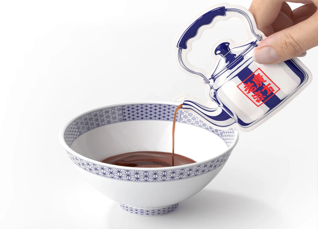
LaoGuangLiangFang
by ShenZhen Lingyun Creative Packaging Design Co.,Ltd.
The Best in Show award goes to the design for which the jury unanimously has the votes the highest.
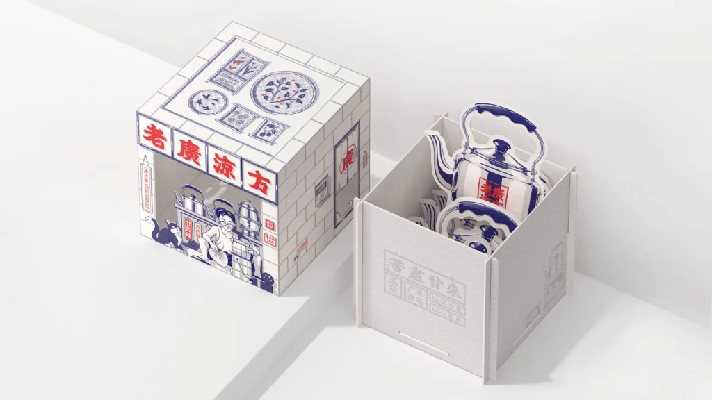
RuBiao Shen’s design for Lao Guang Liang Fang captured the jury’s attention with its nostalgic essence of traditional Cantonese herbal tea shops. By incorporating elements like a middle-aged man in typical attire brewing tea, the packaging elicits the authentic experience of local tea shops.
The square box mimics the tea shop structure, with sides depicting scenes of mothers introducing herbal tea to their children. The rooftop displays the 24 traditional tea flavors. Inside, the tea comes packaged in a small stainless steel pot, reminiscent of how tea is typically served.
This interactive design, rich in storytelling, stands out uniquely in the tea market, offering a memorable and immersive experience. Lately, it feels as though packaging has lost the art of intricate illustration, but this Best in Show winner proves the case for intentional maximalism.
CONCEPT EDITOR’S CHOICE
Manic Panic
Ana Vazquez
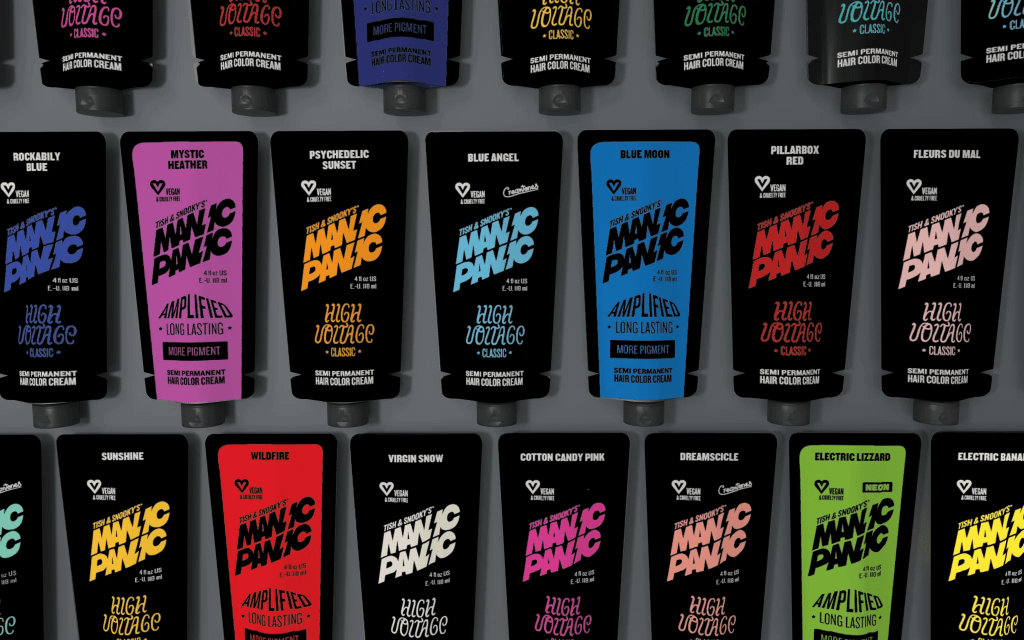
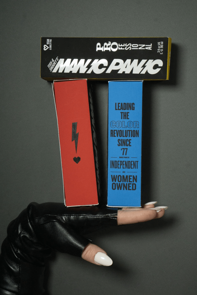
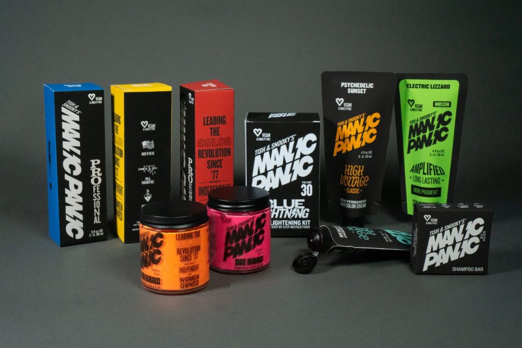
While some of us might not have dyed our hair purple or green since the Bush administration (think Will Ferrell, not Dana Carvey), it’s good to know that Manic Panic is still one of the preferred vehicles for teenage rebellion and impulsive behavior (the good kind). While the brand’s punk roots still shine, our editorial team was smitten with this conceptual makeover from Los Angeles designer Ana Vazquez.
Effects-driven typography paired with bright colors and a black canvas brings some familiarity to the brand, but what sets it apart is its sustainable cache. Gone are the plastic bottles; they’ve been replaced with Kolmar bio-lined paper and cardboard, paper, and glass. And why? Well, the female-owned brand’s punk rock spirit remains intact—except for when it comes to its sustainable footprint. By lending Manic Panic a more (hypothetical) eco-friendly approach, it grounds the brand in its outsider cult status, whose values are central to its identity.
And, yes, we do want to see a Manic Panic shampoo bar. So, after this much-deserved Editor’s Choice win, they should probably bring Vazquez into the fold.
BEST OF CONCEPT
1st Place
JinMaiLang Handmade Noodles
ShenZhen Lingyun Creative Packaging Design Co.,Ltd.
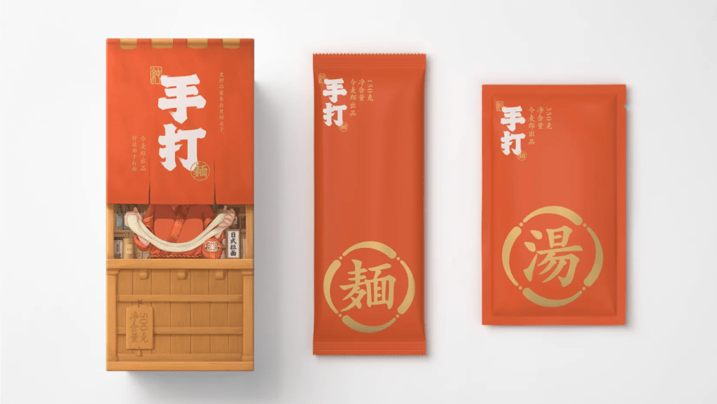
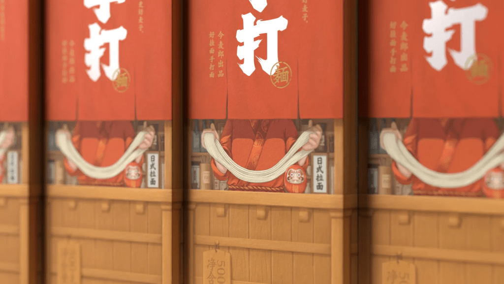
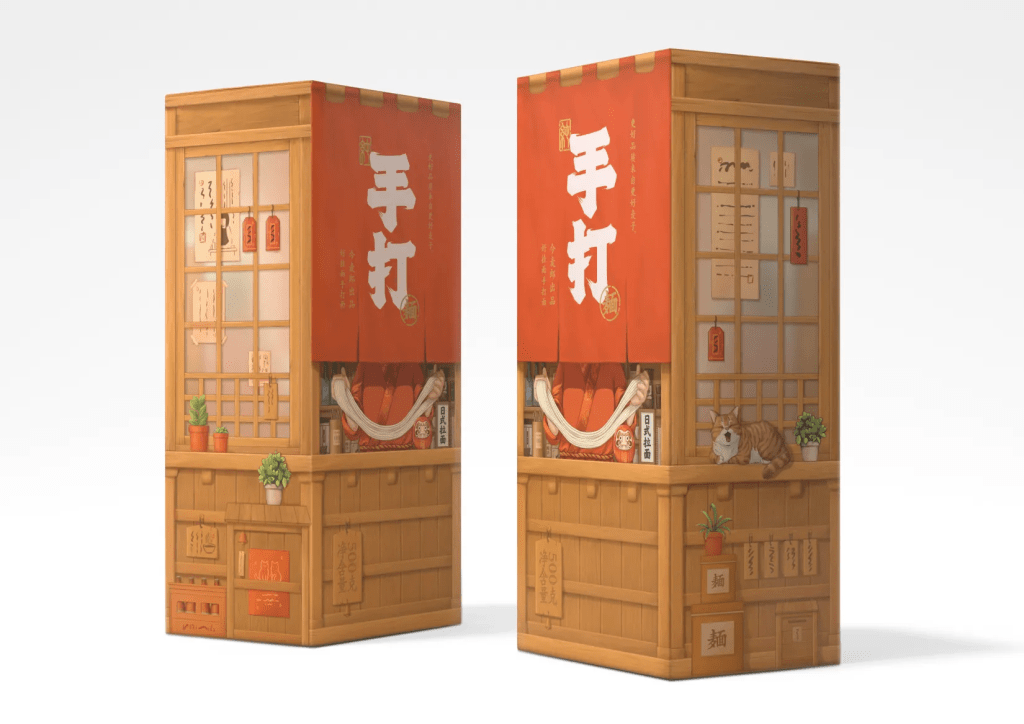
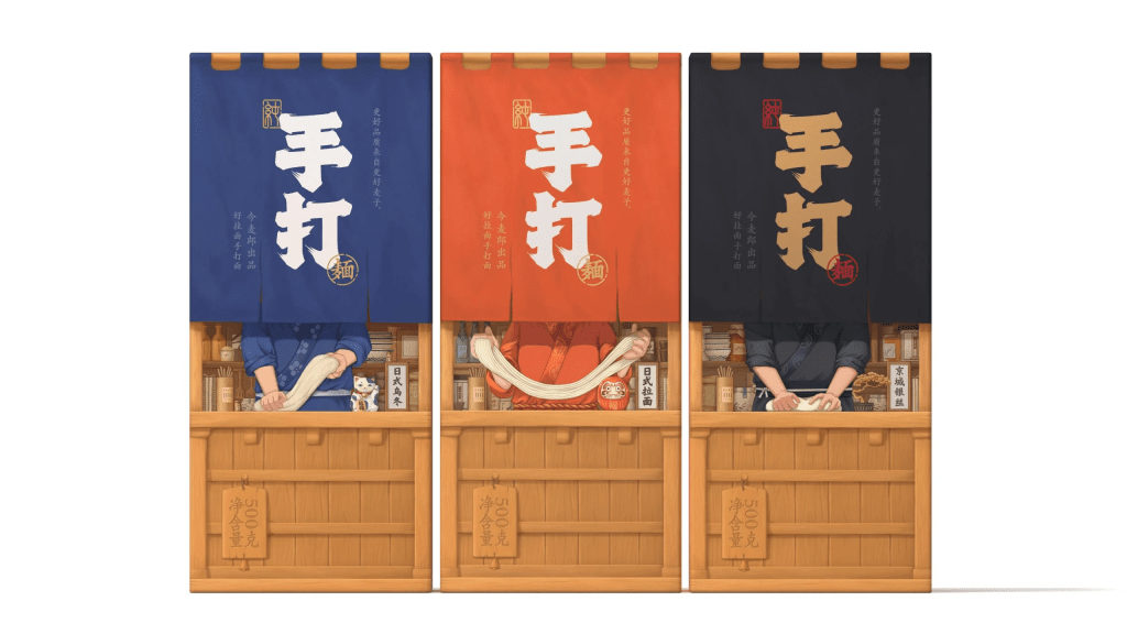
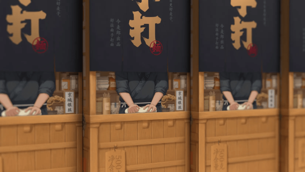
The packaging design for “Jinmailang Handmade Noodles,” creatively directed by Xiongbo Deng and illustrated by Xiaoling Wang and Jialiang Chen, reimagines traditional packaging into a piece of interactive art. The box resembles a ramen noodle house with a curtain revealing chefs preparing noodles.
This design showcases the handmade quality and fresh ingredients and immerses consumers in the experience of an authentic noodle house. By visualizing the noodle-making process, the packaging goes beyond being just a vessel. The brand’s story and dedication to quality are beautifully communicated through the design. It invites consumers to appreciate the craftsmanship and authenticity, making the product more engaging and memorable.

BEST OF CONCEPT
2nd Place
Kobah Chocolate
Troubadour Design Agency
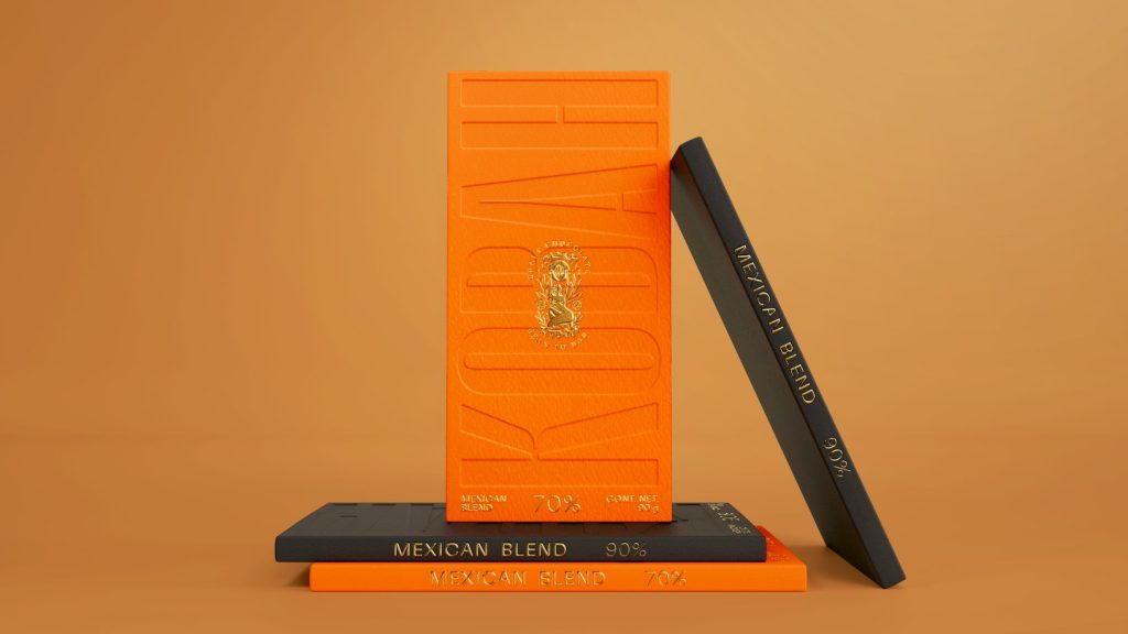
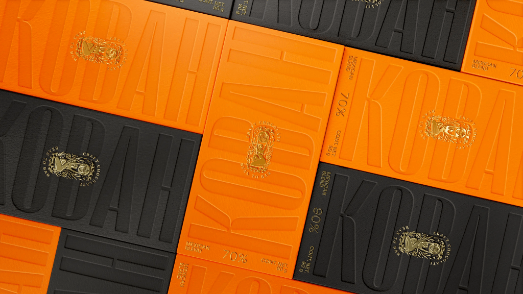
Troubadour Design Agency’s conceptual packaging for Kobah Chocolate is a tribute to the sacred history of cacao. The design comes loaded with reverence and luxury, showcasing the Mayan heritage through solar hues of burnt orange and gold, bold sans serif typography, shiny foil accents, and intricate layered embossing.
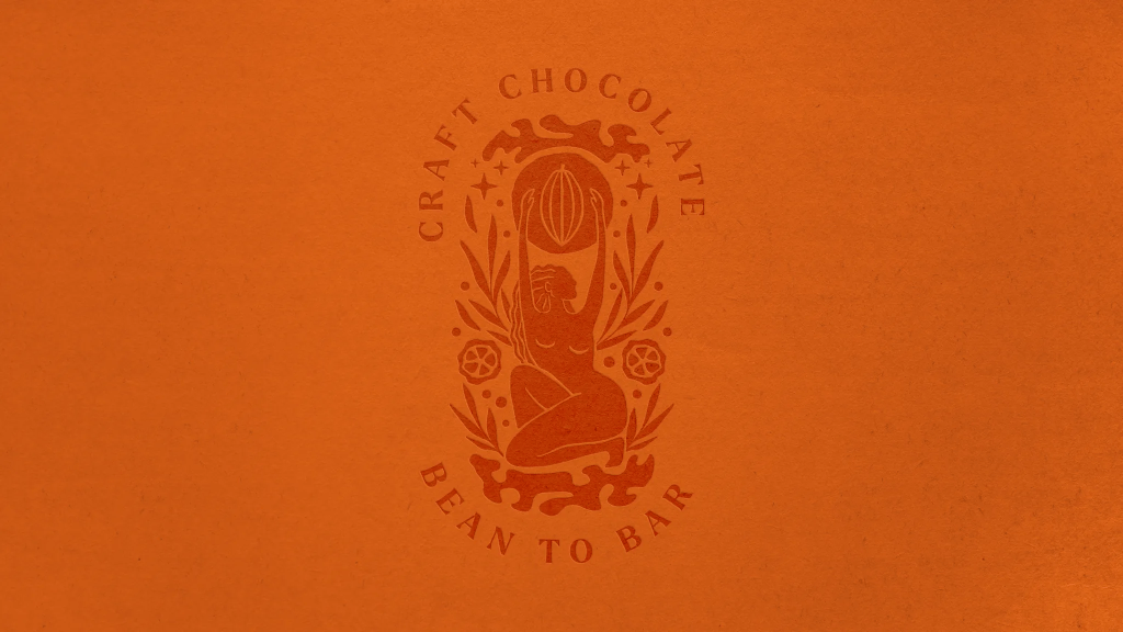
A Matisse-inspired logo sits at the center of the design, symbolizing the divine journey of cacao from the gods to humans. The earthy color palette and intentional use of typography reflect Kobah’s deep cultural roots and premium quality. Each bar celebrates tradition, offering a divine and luxurious chocolate experience. This packaging system is a perfect example of how luxury and minimalism can work together to create a design that feels entirely elevated and almost too beautiful to eat.
BEST OF CONCEPT
3d Place
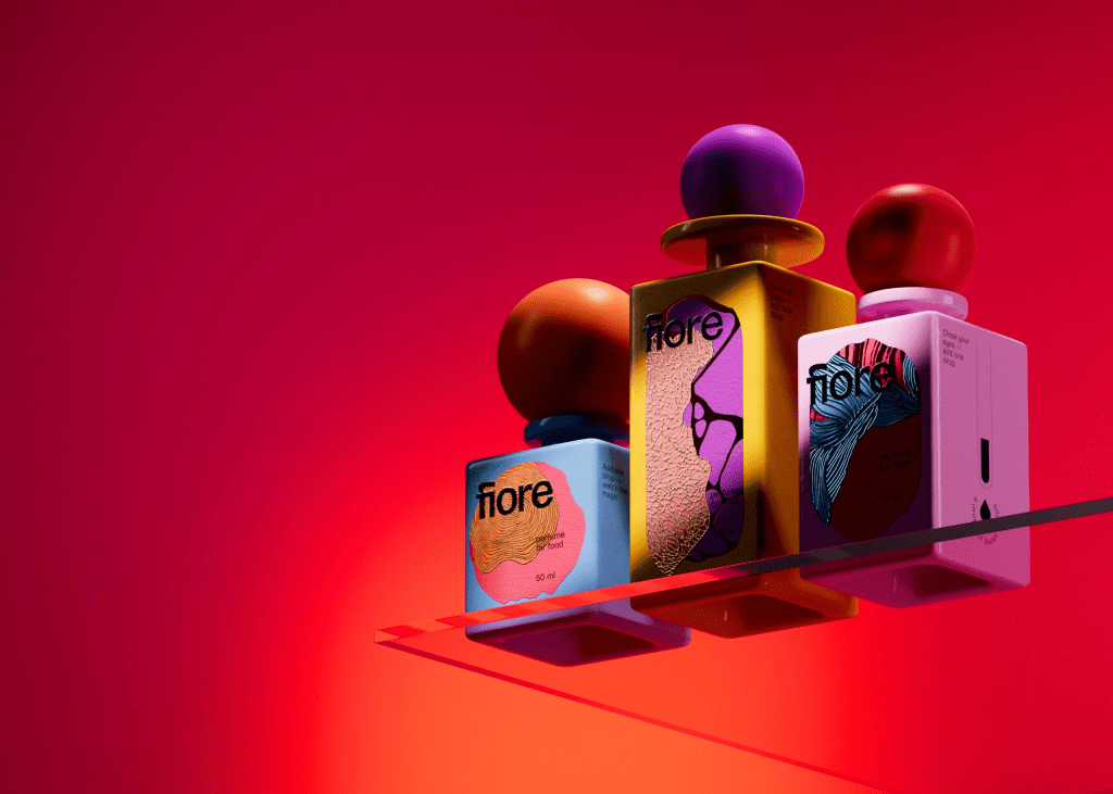
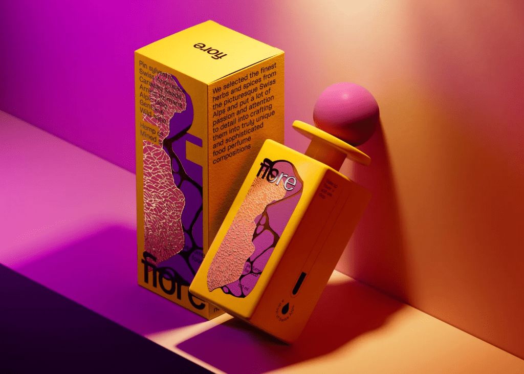
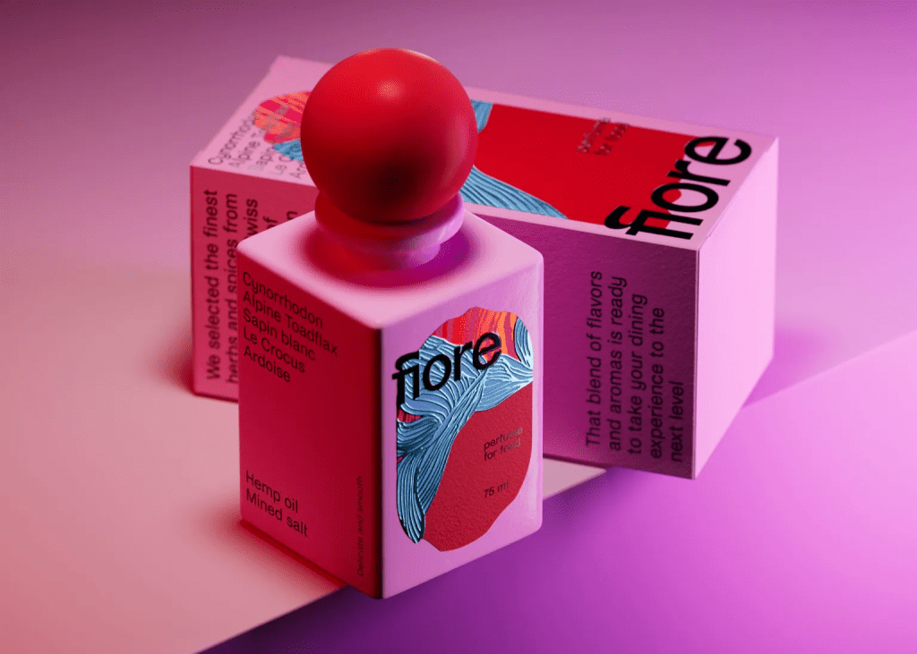
Fiore: Perfume For Food
ARD Design Agency
Perfume for food? For an elevated dining experience? Say less. Inspired by Swiss design aesthetics, RD Design Agency’s packaging for Fiore features simple geometric shapes, bold typography, and refined illustrations. Customized bottles with a unique dropper closure ensure precise dosage and an enhanced brand experience.
Intricate embossing methods, including nano and sculptured embossing, add tactile and visual richness. With an emphasis on sustainability, the bottles are reusable and refillable and made from recyclable materials. Fiore’s design promotes slow consumption, transforming dining into a savored experience and pushing the boundaries of culinary creativity and enjoyment.
